

Zeen
New Member
Hi there,
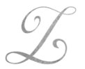
I found a font that I really love, but a couple of people have told me the capital Z looks more like an L.
What do you guys think? And what can I do to make it look more like a Z? Maybe extend the top swirl? I find most of the script style fonts look similar, or the Z looks like the number 3 with a line through the middle which I'm not a fan of.
I want to use this particular font in my personal logo.
Thanks.
")