Diss my logo

Mongus

New Member
Hello,

I have been designing a website to work my graphic design skills. It is a site that will give a new tip about programming every day (in time for breakfast).


Here is the logo I have come up with :
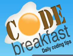
logo.png


Is this a good logo? Is it a terrible logo?
Whats wrong with it?
Do the colours work?
Do the fonts work?
Does the egg idea work ok?
What can I do to make it better?

Have I completely missed the boat?

Am really interested in any opinions and ideas anyone has. I am just learning here - I have no ego - do your worst!

Thanks :icon_smile:
 
A bit too clichéd and detailed. Make it more simplistic and not so illustrative. You need to come up with something more subtle and clever. Just one idea, all the bits of code and syntax instantly conjures up (to me) a mish-mashed 'cereal' of different shapes. Maybe you could use some of those shapes to come up with something that's not so obviously to do with breakfast. Obviously your actual website emphasis is on the coding side, rather than an eggy breakfast. So focus on visualising the coding part, rather than breakfast.
 
Thanks for your feedback.

I totally dig the need to simplify it. I see now Ive been carried away by designing the site first, and just shoving the logo in to the current design.

I need to go back to basics. Will try to sketch out some ideas from what you suggested there - this might take me some time to get anything decent, but will teach me a lot!

I disagree about focusing on the coding side and not the breakfast side. I am trying for a heavy breakfast theme here. The main content is obviously about good code, but I want the design and the incidental concepts in the site to be about breakfast.. For example as part of the reputation system, people will be awarded sausages and bacon icons when they achieve certain things.

Maybe I need to get a logo that shows elements from both breakfast and code.. Food for thought!

Thanks
 
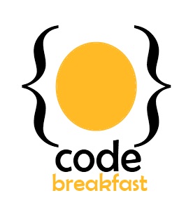
Have done a bit of sketching and quickly knocked this one up. Its far from perfect, but I like the direction its going in. It is much simpler and it mixes the egg concept with the code concept.

It will only work on a white background, which is a bit of a problem, but one step at a time!

logo2.jpg


Is it an improvement?
 
Much better that the first one. I like the one with the larger egg better. Might be worth trying a few different, slightly more elegant fonts. And I'd make it a circle rather than a 'not quite a circle'
 
Back
Top