Designing a responsive website but...

Hello
I am in the process of designing my website but want to make it responsive, the only problem I have is I haven't got Dreamweaver CS5. Is CSS3 and HTML5 supported in CS4?
Is there a way round this if it isn't?
Thanking you's :icon_smile:
 
Website that can adapt itself to any screen width. Struggling with how to scale fonts and images. Do I use percentages?
 
and for the images just use: max-width:100%; max-height:100%; in the css of course :) As long as your div's have been constructed with %'s the whole page should stretch along with the images if this is set... And as NugFX said above - just work with em's for the text and they'll resize according to each device's default font size, or even a user's specific preference; which is good practice in web design.
 
and for the images just use: max-width:100%; max-height:100%; in the css of course :) As long as your div's have been constructed with %'s the whole page should stretch along with the images if this is set... And as NugFX said above - just work with em's for the text and they'll resize according to each device's default font size, or even a user's specific preference; which is good practice in web design.

Thanks for this

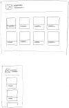
Untitled-1.jpg Have attached what I had in mind. How would be the best way to do this? If I used percentages (ie each box has a width of 25%) would that mean even on the smaller screen it would be 25%?
The thought was that the boxes would fill the available space both on the largest and smallest screens but still retain the proportions. I don't quite know how to solve this.
 
Ok so basically each of the boxes, which I assume are divs housing the images - should have a width of lets say 17%, because don't forget you will need to allow for your margins as shown in the diagram you provided... You must make sure all elements within the wrapper add up to 100% width. I would keep the height unspecified where possible, so that the height will stay fluid to accommodate your text and images.

So just to reiterate ; have the wrapper width set to "auto", this will stretch the entire page to always fill the screen width. Have elements inside the wrapper made up of %'s so they add up to a total of 100%, not forgetting margins. Then use max-width:100%; max-height:100% for the images. The only thing left to do now would be to create some I.E 6 & 7 specific css to combat the double margin bug you'll encounter... but you can google that, it's a topic all of it's own!

Hope this helps

I think that worked but the boxes don't snap to fill the screen width, they just seem to resize to fit the screen. Not sure how to resolve it.

Untitled Document
 
I'm busy trying responsive web design for the first time too. Using a premade Wordpress template but have things like Contact Forms to consider. It's a barrel of laughs isn't it?

You can check my progress on; Home | Gee Gees On Board
 
Also, if by snap to the screen size you mean you want them to centrally align, have you tried "margin: 0 auto" ?
 
Back
Top