You are using an out of date browser. It may not display this or other websites correctly.
You should upgrade or use an alternative browser.
You should upgrade or use an alternative browser.
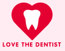
Dental clinic logo
- Thread starter CDB
- Start date
Wardy
Well-Known Member
I normally prefer simple logos, but this is a bit too simple for me.
I'm assuming it's for a personal or course project, but I think you could do better. It might be something that would do for a sticker for a child, but
not for a logo. It just doesn't have the gravitas or professionalism enough for a dental studio. Just google 'dental studio logo' and you will hopefully see what I mean.
The tooth could be more accurate, and if you're clever you could even try and make it in to a vague heart shape maybe. Font choice not good. Heart is way too big.
If it's a personal project, I would change the name - I'm not sure loving one's dentist is very ethical!
@Wardy , thank you.
I just wanna learn logo design best practices.
Of course, I googled other dental logos, but tbh I didn't find any to say I like it.
Most of them look unprofessional as well, in my opinion.
@sprout , thank you.
The first one was a heart-shaped tooth)
I see myself that it's primitive, trying to generate some more ideas...
Really - cos I just google "Dental Logo Heart" and found plenty of much higher standard than yours.Of course, I googled other dental logos, but tbh I didn't find any to say I like it.
Conceptually it's not bad - the execution is bad though, as you realise.
Start by sketching your logo first - don't use the computer. Don't even look at it.
