You are using an out of date browser. It may not display this or other websites correctly.
You should upgrade or use an alternative browser.
You should upgrade or use an alternative browser.
david bailey website
- Thread starter bryan1690
- Start date
sthomas
Member
Hi,
Thanks for posting up some examples of your work on the David Bailey website.
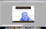
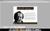
It's difficult to get a proper feel for the work as the screen grabs are quite small. On first viewing I think it'a a good starting point although I'm not too keen on the blue duotone image. I think most of Bailey's best work is in B&W and therefore I don't see the relevance of the blue duotone. Personally I would keep all of the pages in B&W (including the logo).
I would make the logo a lot smaller and think about creating pages that are closer related to David Bailey and his photography. At the minute, the website could be about anyone. Sorry to be slightly negative but I think by working a bit harder with the layout and images, you have the opportunity to move the project up to the next level.
By all means keep posting and I'd be interested to see how the project progresses.
Cheers
Scott
bryan1690
Member
Hi,
Hi Scott,thanks for your quick response and constructive criticism,and sorry for the amateur screenshots i,ll try later to get the gif files uploaded.I take on board everything you have said regarding the colour scheme and will definetley look at editing it to suit.Really appreciate the time you have taken to point me in a direction with this design.
Bryan
yourmailman
New Member
bit hard to tell from the screen shots, looks ok though, nothing too fancy, looks like it will do the job, try exporting something a bit bigger though so we can get a better look
bryan1690
Member
Hi there,
cheers mate,yeah im actually redoing the pages as we speak ,trying to sort out the index pages in dreamweaver now though it's proving to be a bit of a nightmare.This site was my first attempt as part of the course so was always going to be basic,think they want us to get the theory of actually building the sites rather than mastering them first attempt,it will do lol .
Bryan
yourmailman
New Member
ok cool, well very good for first attempt.
dreamweaver can be a bit of a mare it adds loads of random code.
there are plenty of tutorials on line though
good luck
dreamweaver can be a bit of a mare it adds loads of random code.
there are plenty of tutorials on line though
good luck

