You are using an out of date browser. It may not display this or other websites correctly.
You should upgrade or use an alternative browser.
You should upgrade or use an alternative browser.
Dancing Lights Design.
- Thread starter 8th
- Start date


bigdave
Well-Known Member
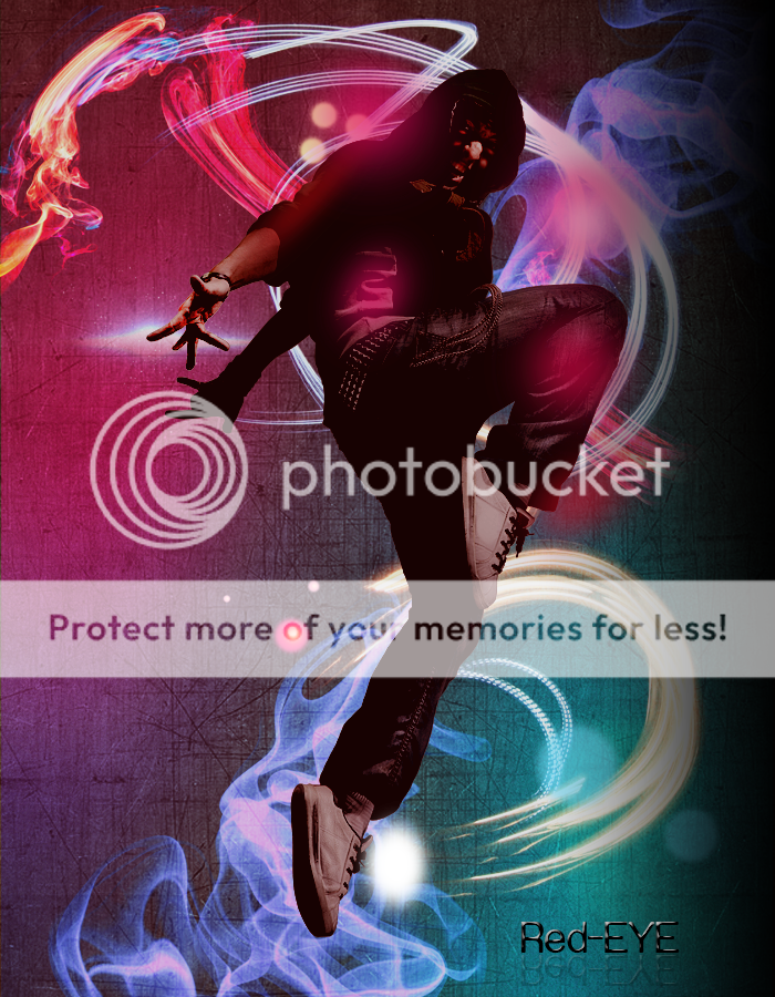
On the whole it's a nice image and a good attempt if you're still learning.
My comments & opinions (not criticism, who am I to say if your work is correct or not):
• The right hand looks slightly over-worked and is developing a posterized/colour burn feel to it that isn't consistent with the rest of the image and also has a bit of a halo going on (a fine line of light pixels where the images has been separated from the background without enough feathering) across the palm.
• The pink gradient/orb across the knee and the one just above it over the light trials are slightly too solid. (perhaps play with your blending modes to allow some more black through).
• It would probably benefit the composition to see the foreground and background elements interacting with each other (I think this is what you've tried to achieve with the pink orbs). Perhaps weaving the figure through the light trails would reduce the feeling of 2 images layered over each other?
Tony Hardy
Well-Known Member
All I've got to say on it is that it feels as thought the character should blend in with the background some more.
Dave already mentioned that, integrating the light and colour over the character will help it feel seamless from the background which with this sort of thing is something I'd be trying to achieve.
Dave already mentioned that, integrating the light and colour over the character will help it feel seamless from the background which with this sort of thing is something I'd be trying to achieve.