Critique

Hi Guys,

I'm Eva, I've been a member for a while now but I haven't posted in a looooong time. I've had a massive designing break. BUT I'm back to it.

I've finally decided to tinker with a Logo for myself. Which I'm sure you all understand has been THE most difficult design. I just could not decide on anything. Saying that, I did tinker my way to this. I'm not dying about it but it is the most developed design so far. I'd love your thoughts on it though? Should I go back to the drawing board?
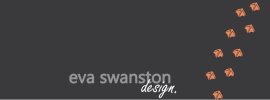

Eva-Swanston-Timeline-Cover.jpg

Eva-Swanston-Profile.jpg

(I am in work so only have these mock ups for a FB page to show you. The 'e' emblem sits above and centered to the typography.)

Regards,

Eva
 
Hi again Eva... love the pun! And I would think for FB page would be fine - though perhaps some cheerier colourways? Surely we've had enough of 'grey days' this year?!
 
I think we need to think about more than just 'this year' when it comes to logo design colours though of course don't we :) It needs to stand the test of time for a good ten years at least so I'd just think about the sort of image you want to project and who your target market is. Small business? Big brands? Low budget? Big budget? For example.

Amanda
 
Well, I'm a bit of an amateur really, and have only been doing it for friends and family and have had only a few paid jobs outside of that. So in reality I will be trying to target small businesses on low budgets? Are the colours a bit boring? What do you think of the design so far?

Eva
 
Hi Eva,

I have to say I think your foot/web prints are bloody great. Really very charming. I think it's a lovely identity, plenty of style and wit. Great work. I have no problems with the colours - grey might be a bit over-used but the most important thing for your personal identity is that YOU like it. You'll have to look at it every day.

My only critique - and I'm being a picky bugger - would be to have another look at the type. Maybe go to fontsinuse.com for some inspiration (great for seeing what typefaces look great together) or have a look at Helvetica Alternatives Fonts | FontList | FontShop for some faces you might not know. Spend a little time getting the type spot-on and you'll have a really great, slick identity that will serve you well for a good while yet.

Lovely work. Stop calling yourself an amateur!

Rob
 
The 'e'/swan device is quite nice (as is the palette) but those inner curves look like they may need a bit of attention. Not crazy about the typography or the footprints - if you are attached to them, though, I think they'd be better (in a positive, psychological sense) if they were heading upwards.
 
Thanks Rob and Dave,

I will definitely be looking into the typography. But I got a bit fed up and I wanted to get my facebook page up and running. And being indecisive was stopping me doing that. I see what you mean about the inner curves Dave, I think I've been looking at it for so long I didn't see it. The foot prints where actually used on a facebook timeline cover photo, and the footprints lead down to the like button? Do you think I should scrap that idea?

Thanks for the comments again, I appreciate it.

I'm currently working on another project so my design will have to wait. I will post the progress here though.

Cheers,

Eva
 
Back
Top