grafyte
New Member
Hi all.
New here - so hello. This is my first post (and largely the reason for signing up - although I intend to start frequenting the forums, since I'm at a loss for solid design communities)
Anyway - I've been working on a brand identity for a (well, my) branding company - and I'd like to get some more eyes. Feedback is crucial for me, so any thoughts and feelings would be more than welcome.
Here's the explanation:
Lux
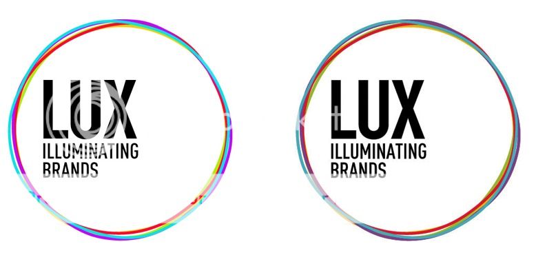
Lux is an agency that concentrates on brand as a whole. The design of the marque represents 5 key areas of work Lux does (hence 5 circles).
- Advice & Insight
- Management & Support
- Creativity & Conceptualisation
- Design & Production
- Results & Increased Awareness
As the marque gets smaller, the 5 areas begin to blend into one another to form a whole (the entirety of the full-services). The vibrant colours represent the fresh passion and excitement that Lux has at the core of the work done.
The circles represent the "full-circle" nature of brand work, the infinite possibilities, the lack of dead-ends, the notion of all-encompassing, and the imperfections in the circles represent the liquid-nature of brand, and the ever-evolving movement of across-the-board brand work.

