Critique Please!

Mark76

New Member
Hi all

Just after some feedback on the attached.

This is very much work in progress so the typography is not sorted and the whole thing needs to be redrawn again and tidied up but Its just a basic sketch and I would be interested to see what people think

Its a logo to be used to represent sport, and activity but not specific to any one sport. So the whole idea is based on the final finishing line, a 'result' etc

Its one of these situayions where i've been looking at it all day and I can clearly see what it is meant to be but I would be interesting in hearing how others view it.

Any good, or is it back to the sketchpad?

Thanks!
 

Attachments

  • wip.jpg
    wip.jpg
    46.9 KB · Views: 24
I really like it. Although I did have to go back and read what the image was after looking at it. I think it's because there are too many arms on your image. It just doesn't look like the finish line.
 
Thanks Arrivals

Yes i know what you mean, the idea was meant to be that the red 'ribbon' was the finish line. But I think I have over simplified it, originally I wanted to add shading and make the whole logo look like two ribbons but I think that might be over ambitious

I think it does look very animated and it is meant to be extremely stylised but i think i might have over the top with the simplification!
 
Thanks both, yes the BA thing has been playing on the back of my mind at bit TBH. I think a lot of that has to do perhaps with the colours. Maybe a change would help.

The main thing I'm concerned about is if it's difficult to see a (very stylised) figure in there. I wanted to create the idea of a figure moving but for it to be very abstract.

I guess if its difficult to see that then the idea is a bit of a write off?
 
Proberbly not helpful but it does say British Airways to me

This exactly the thought i was trying to get out my head when i saw it but i couldnt! i was googling travel companys to try find what the thought was b4 commenting and sounding like i was making something up!

Anyway it still looks nice and i think it deffo represents movement more so if the your type was to be slightly slanted aswell.
 
The main thing I'm concerned about is if it's difficult to see a (very stylised) figure in there. I wanted to create the idea of a figure moving but for it to be very abstract.

I guess if its difficult to see that then the idea is a bit of a write off?

I got the figure straight away, I didn't get the "finishing line" concept at all, still struggling a bit to see it? haha. Blind as a bat at times.

I do like it though, however, does remind me a bit of BA too.
 
I like the concept and I can see the figure perfectly now that I know to look for it, but I can't say that it came straight into my head.

The type works well with the style and so do the colours. I wouldn't say that it's a write-off though as it could look great, it just maybe needs a bit of work to make the figure clearer.
 
Hi all

Thanks very much for taking the trouble to post comments they are all very useful.

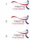
I've adapted the design slightly to the three options attached. Although No.2 is more obviously a figure it's a little bit of a compromise as I wanted to try and avoid 'dots' for the head etc although this does mean that it is moving further away from the ribbon idea which is a shame - but at least it will look less BA/old BT logo!

I extended the red line to make it more obvious, although again, I find the end bit slightly more clumsy being slightly longer but it is a bit of a compromise. (Its also appallingly drawn but I'll tidy that later:icon_wink:)

What do people think of these options, let me know your feedback. thanks in advance!
 

Attachments

  • WIP2.jpg
    WIP2.jpg
    24.1 KB · Views: 15
I do think number two works well though, I can see what you're saying about moving away from the ribbon idea but I'm not sure it does.

Number two certainly pushes the concept more than before I feel, without compromising anything in the sense that it still looks stylish and I do still really like it.

My only reservation is that I can't tell whether it helped me to spot the concept or whether I was just looking for it anyway as I already knew about it now!
 
Number one works for me.

The ribbon thing is definitely more apparent, and in regards to the human figure, I think given it a circle for a head is really giving the game away.

My favourite logos are the ones that you have to discover.
 
number 2 is most def the best. Its alot stronger as you can see its a head. I would maybe put a small ribbon underneath the leg so it looks like the back leg is behind if that makes sense?
 
I like all 3 of them and think either of them would work. The problem is the colouring of them. Most people have now noticed the similarities between the ribbon on your design, and the one British Airways use, but the fact you're using red and blue makes it just as noticeable.

I'm not quite sure you'll be rid of the link to BA with both of those issues.
 
Back
Top