

davewill
Senior Member
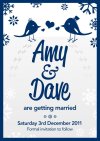
Hi guys, Im getting very close now to getting my Save the Date cards printed. Ive changed the design slightly since the last version I showed on here to make the card A6 in size. This is to save on costs and make it easier for us to find an envelope to match.
Due to the change in size Ive had to re-arrange some of the elements on the design so Id appreciate any feedback on the overall balance and structure. I dont want it looking too gappy (the previous design was narrow so theres a lot of new space now with the changed to A6)
Also, we are planning on getting the design letterpressed. The printer has suggested just letterpressing the words Amy&Dave but I imagined all of the navy blue to be letterpressed. Our printer has also suggested getting rid of the grey gradient and blind debossing the white snowflakes around the base of the design.
I have no experience with this kind of printing so what do people think? Would white snowflakes on a white background look good when blind debossed? And should we just letterpress our names or the whole thing?

 )
)