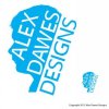
Critique for Logo Design - Alex Dawes Designs

Hi all, I have created this logo as my identity as a freelance designer and I would be very grateful if I could get your professional advise. Please feel free to be as brutal and honest as possible but I will also need advise on how to improve my design if need be. I have chosen the colour blue for the logo as my research into colour theory stated that it is calming, refreshing and friendly. I have shown a large and smaller logo design so you can see it up close and when minimised. I look forward to reading your comments.
Many thanks.
 

Attachments

  • Alex Dawes Designs Logo  .jpg
    Alex Dawes Designs Logo .jpg
    13.4 KB · Views: 41
Last edited:
Hi all, when I uploaded my image it reduced the quality. Can anyone suggest how to improve the quality? I have tried to upload a PDF but even on the smallest file size it is to big.
 
Not keen on it really. To me, the scaled down version doesn't look good at all. I can read it, but it all looks too tight and crammed in. You've given us some theory on the colour blue, but the blue you've chosen seems way to bright and sharp to be considered calm.

I'd ignore colours at first. Nail the shape and layout of your logo, then add colour later. If it looks good in black and white it'll look good in colour.

I'd steer away from using a vector shape head as a logo. It looks too fussy to me. Even if it is you. Whilst it looks alright when it's big, you can't actually see the detailing of the hair or anything when it's scaled down.
 
One aspect I would maybe look at is how legible the text would still be once the logo has been reduced in size a bit.
 
Also, unless there's something particularly striking and unique about your appearance, why use a silhouette? For instance, if you were well known for having spiky hair, or a pointy beard. Try some other stuff out. Go back to the pad and think about what makes you unique. Sketch some ideas out, scan them and post them on here. Then people won't be commenting about the spacing of the type, just about the idea.
 
It definitely doesn't scale down very well. I don't like the concept particularly either. I'm with SparkCreative. If there's nothing about your appearance you're kind of renowned for, then, it doesn't have any connection to the logo other than it's you.
 
Back
Top