monicamaza12
New Member
Hello everyone!
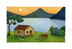
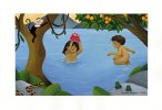
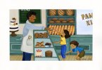
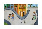
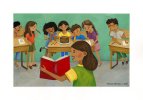
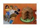
I'm new to the forum, but I'd thought I'd reach out. I am working on my master thesis on design and illustration, and I'm currently creating a children's picturebook. As part of my user testing investigation, I am looking for critique and feedback on the illustrations I have created. Without knowing anything about the story, let me know what you think about these illustrations!
Some questions to think about: Do these illustrations take you somewhere in particular? Is the color system balanced and harmonious? Is the style a good choice for a children's book? Is this something you would buy for your child, grandchild or niece/nephew?
Thank you in advance for your help.
Monica