Critical Feedback for Design CV

XINMEDIA

New Member
Hiya, first ever post on this forum so greetings to you all. Ok down to brass tax. I'd love to hear some feedback on my current CV if anyone would like to take a gander;

Preview

Design CV Example.jpg

Link to larger image

It's the first draft so please don't be too mean but as always any ideas or critique is welcomed. Thanks in advance. :)
 
I quite like it. A few things I've noticed typography wise though;

You start your sentences with lowercase letters. Whilst this is acceptable in certain case (I do it quite often), in body copy it looks a little bit like you don't know how to write correctly. People may not understand that you did it intentionally (it's happened to me before now).

You've mixed ampersand and "and" in the copy. You should try and use "and" in the first instance, and save ampersands for when the information is short and you want to save space (in titles, headings, etc). Never mix the two, especially in the same sentence.

You have an orphan at the end of your first paragraph (a single word on a line). Also, the ragging on the ends of the columns is quite ugly.

Apologies if all that jargon went over your head. Whilst you could be forgiven for missing these, more and more motion design involves typography, so it's worth paying attention to it and brushing up on your typographic skills and knowledge. It will be one more thing to add to the CV too :icon_biggrin:
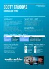
 
I know it's only a CV, but as a design it's a little bit boring and safe. You say you can do a lot of things, but that isn't reflected in the design. The best ones
I've seen look more like infographics, with pie charts and diagrams, etc.

I would lose "wibbly wobbly" etc and some of the text in that bit. It's ok to try and get humour in there, but some might see that as a bit too glib
and unprofessional.
 
If there's any suggestion that people might want to print your CV for themselves, I wouldn't go with a coloured background - you lose a lot of control over the way it looks and people can get pissy about the drain on their ink resources.
 
Back
Top