You are using an out of date browser. It may not display this or other websites correctly.
You should upgrade or use an alternative browser.
You should upgrade or use an alternative browser.
Countryside House
- Thread starter TallPaul
- Start date


Thewholehogg
Active Member
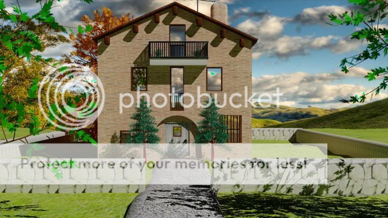
Nice...it looks very Roman.
malcolmDesign
Junior Member
The only thing that throws me off a bit are the windows... they appear to have the same cloud formations as the background. They should really reflect what's in front of them, or show darkness from within the house. Other than that, it looks great.
Levi
Ultimate Member
Ok
Don't take any of this personally but this is the sort of thing I do all day long (more product orientated usually though) so take it more as constructive criticism")
First off nice attempt
Now the critique
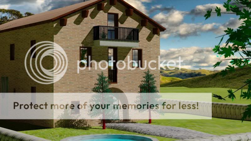
Brick scaling is off, they're too big and stretched across the front of the building - try working in real world scales etc. As said there is a a uniformity to the pattern, if you're using 3ds max design, you can use the architectural materials to add in a randomised nature to the pattern when using the built in renderer (vray etc is slightly different).
concrete for the balcony - that would have a textrure, very subtle but it would be there
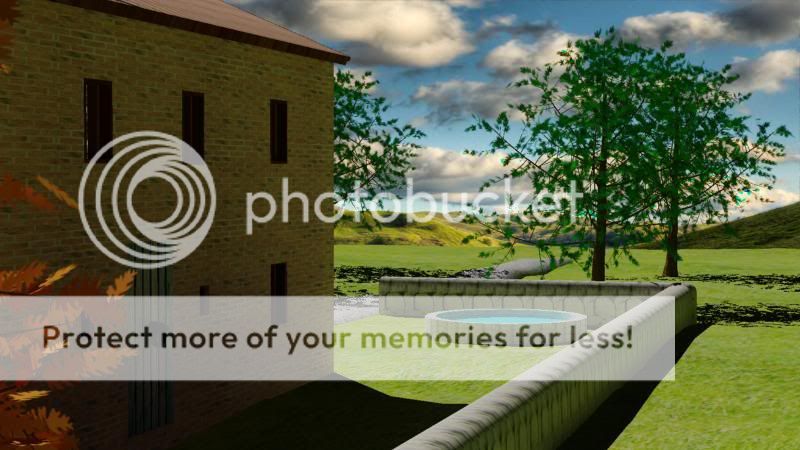
No glass (or poor material choice) and it's pretty obvious that your windows line up both sides/ends (not an issue if it's meant to be that way) and the building has no partition walls inside. The clouds going through need to be reduced in contrast (and mirrored) a little if you want to do it post processing you could overlay a black box where the windows are to tone it all down.
External wall - looks like the scale of the blocks is off, could also do with a bump map adding to give it that extra dimension you get when looking at it in real life. Same with the path.
Roof tiles would have a bump map to give it the ridges you see in real life, especially with the choice of tile you have (my opinion)
You've got a cloudy sky yet there's no clouds on the floor - you could add a secondary map onto the grass material to add in a slightly patchy dark area like you would get with the clouds.
I'd also say the shadow would be slightly softer with a cloudy sky too but thats a personal thing.
Also think the lighting used could be a little too harsh in relation to the scene used.
I know the trees aren't your fault but sometimes it's better to use photoshop to add in details like trees during post processing
Don't take any of this personally but this is the sort of thing I do all day long (more product orientated usually though) so take it more as constructive criticism
First off nice attempt
Now the critique
Brick scaling is off, they're too big and stretched across the front of the building - try working in real world scales etc. As said there is a a uniformity to the pattern, if you're using 3ds max design, you can use the architectural materials to add in a randomised nature to the pattern when using the built in renderer (vray etc is slightly different).
concrete for the balcony - that would have a textrure, very subtle but it would be there
No glass (or poor material choice) and it's pretty obvious that your windows line up both sides/ends (not an issue if it's meant to be that way) and the building has no partition walls inside. The clouds going through need to be reduced in contrast (and mirrored) a little if you want to do it post processing you could overlay a black box where the windows are to tone it all down.
External wall - looks like the scale of the blocks is off, could also do with a bump map adding to give it that extra dimension you get when looking at it in real life. Same with the path.
Roof tiles would have a bump map to give it the ridges you see in real life, especially with the choice of tile you have (my opinion)
You've got a cloudy sky yet there's no clouds on the floor - you could add a secondary map onto the grass material to add in a slightly patchy dark area like you would get with the clouds.
I'd also say the shadow would be slightly softer with a cloudy sky too but thats a personal thing.
Also think the lighting used could be a little too harsh in relation to the scene used.
I know the trees aren't your fault but sometimes it's better to use photoshop to add in details like trees during post processing
TallPaul
Member
Thanks for the criticism Prefer criticism than to make shabby work This was my first project on making something life like and i admit that the difficult part for me are the textures.
@malcom The windows have reflection maps which reflect the environment so i think them clouds are actually from the front.
@Jimlad Yes agree it looks very uniform, i was looking for the old style bricks as the reference photo had but couldnt find the texture anywhere It is sunny, maybe to sunny.
@Levi I would have used real life measurments but i didnt know the size of he house i had for reference and only had one angle to work from
Has no walls inside because the project was to do an interior or exterior, no way was i going to do both lol The glass was made using the material editor then adding a reflection map at 30, the glass material specs i had to google for.
What kind of map would work on the grass for the shadow? I wanted to do 3D grass but it froze my PC
Must remember the bump maps they make a hell of a difference.
Thanks guys all taken onboard for when i make something else
PS: Any good architecture 3D Max tutorials around?
EDIT: BTW it has no windows on the back
Prefer criticism than to make shabby work This was my first project on making something life like and i admit that the difficult part for me are the textures. @malcom The windows have reflection maps which reflect the environment so i think them clouds are actually from the front.
@Jimlad Yes agree it looks very uniform, i was looking for the old style bricks as the reference photo had but couldnt find the texture anywhere
It is sunny, maybe to sunny.@Levi I would have used real life measurments but i didnt know the size of he house i had for reference and only had one angle to work from
Has no walls inside because the project was to do an interior or exterior, no way was i going to do both lol The glass was made using the material editor then adding a reflection map at 30, the glass material specs i had to google for.
What kind of map would work on the grass for the shadow? I wanted to do 3D grass but it froze my PC
Must remember the bump maps they make a hell of a difference.
Thanks guys all taken onboard for when i make something else
PS: Any good architecture 3D Max tutorials around?
EDIT: BTW it has no windows on the back
Levi
Ultimate Member
you can reduce the opacity of the reflections (noramally the 0-100 options down bottom - lower equals more transparent) in the material settings depending on how it's been set upTallPaul said:@malcom The windows have reflection maps which reflect the environment so i think them clouds are actually from the front.
guess, seriously it's something worth learning although generally once you're used to it you can see by looking at it that the scales off@Levi I would have used real life measurments but i didnt know the size of he house i had for reference and only had one angle to work from
lazyHas no walls inside because the project was to do an interior or exterior, no way was i going to do both lol
you know max has a glass material right :up:The glass was made using the material editor then adding a reflection map at 30, the glass material specs i had to google for.
there is a trick where you can use a noise map to simulate the stems of grass or you could do hair and fur approach. Personally I've got a plugin for vray plus some custom 3d models which I can useWhat kind of map would work on the grass for the shadow? I wanted to do 3D grass but it froze my PC
This should keep you busy though
Grass Displacement FAQ
yep - the easiest way to think of adding materials is that NOTHING is perfectly smooth, even glass, the amount of bump a material has can be so minimal that it's not worth adding (like with glass) or it can make a huge difference like with the walls.Must remember the bump maps they make a hell of a difference.
Thanks guys all taken onboard for when i make something else
Just Sadiqa
Member
Cool looks good!
Just Sadiqa
Member
Lol I get what you mean about the clouds! Did you design the building?