desinger101
New Member
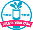
This logo was made using a practice brief, which was from a charity that wanted a new logo design for a charity campaign called 'splash your cash' which was in aid of helping deliver clean water. The charity was called WaterWater, and wanted their name included in the logo somewhere. They wanted the logo to be unique, so after doing some reaserch into other charities in the same field, finding that they focused on having one single drop of water, I decided to go with the splash of water, which fitted the title.
I got the idea for the splash splashing from the charity box when looking at the title 'Splash Your Cash'. I wanted the campaign title to stand out, so I used a triad colour scheme when designing the banner. I am an amateur graphic designer, and any helpful critisism would be amazingly helpful. This design took 4.5 days to complete, which was the guided time to be spent on the project.
My target audience for the project was not a specific demographic. This is because charity is something that appeals to everyone. Due to this I used bright colours with a relativly neautral typeface. I wanted to keep the design looking simple, with a minimalist feel.
Thank you for your time if you have got to the end of this")
I got the idea for the splash splashing from the charity box when looking at the title 'Splash Your Cash'. I wanted the campaign title to stand out, so I used a triad colour scheme when designing the banner. I am an amateur graphic designer, and any helpful critisism would be amazingly helpful. This design took 4.5 days to complete, which was the guided time to be spent on the project.
My target audience for the project was not a specific demographic. This is because charity is something that appeals to everyone. Due to this I used bright colours with a relativly neautral typeface. I wanted to keep the design looking simple, with a minimalist feel.
Thank you for your time if you have got to the end of this