mrp2049
Senior Member
In the ever growing Abdul vs Mo saga, something interesting has arisen, and I am willing to get the ball rolling.
So I welcome you DF to post examples of your work from several (5+ish) years ago, a few years ago (1-2) and then a very recent piece.
One challenge as a designer is learning to be self critical to improve, so I think this should be part of it. I'm going to stick to posters, as I do love doing them.
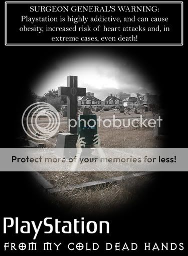
I did this piece in my first year of uni (2002), I am still proud of the idea, but I know now that there is a mess of text on there and this gives it a general inconsistancy. Also the way the image is framed is terrible, end of. The way I have layered the hands onto the graveyard image is incredibly rough also, I could have done with going back and re taking photos to get the balance better, but because I was a first year, it was "close enough".
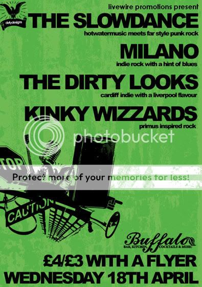
This was 2006, leading on the typography is overly tite, whilst this looks kinda cool in place, it is very inconsistant throughout. I think the texture is almost distracting, as it is not detailed enough to add to the design. The messy jumble of vectors has some innacuracies in how they were cut out, and are not constistant in detail. Considerations for bleed space on this were non-existant!
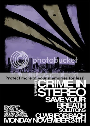
recent one, in this case I based the design around reference from the cover of their most recent record, likewise the typographical layout is similar to the logo. The typography is a little crammed in, I did the visual element and then had to fit info around it.
Sometimes admiting it to yourself is the hardest part, but being self critical sure helps you develop. Sometimes you have to be overly self critical to get the best from yourself, but the balance is know when to stop so you can actually get a job done!
Anyone want to follow?
So I welcome you DF to post examples of your work from several (5+ish) years ago, a few years ago (1-2) and then a very recent piece.
One challenge as a designer is learning to be self critical to improve, so I think this should be part of it. I'm going to stick to posters, as I do love doing them.
I did this piece in my first year of uni (2002), I am still proud of the idea, but I know now that there is a mess of text on there and this gives it a general inconsistancy. Also the way the image is framed is terrible, end of. The way I have layered the hands onto the graveyard image is incredibly rough also, I could have done with going back and re taking photos to get the balance better, but because I was a first year, it was "close enough".
This was 2006, leading on the typography is overly tite, whilst this looks kinda cool in place, it is very inconsistant throughout. I think the texture is almost distracting, as it is not detailed enough to add to the design. The messy jumble of vectors has some innacuracies in how they were cut out, and are not constistant in detail. Considerations for bleed space on this were non-existant!
recent one, in this case I based the design around reference from the cover of their most recent record, likewise the typographical layout is similar to the logo. The typography is a little crammed in, I did the visual element and then had to fit info around it.
Sometimes admiting it to yourself is the hardest part, but being self critical sure helps you develop. Sometimes you have to be overly self critical to get the best from yourself, but the balance is know when to stop so you can actually get a job done!
Anyone want to follow?