Considering a personal rebrand

arron

New Member
Hi everyone!

I'm considering a bit of a personal rebrand because with my current style I've shoehorned myself into a mostly black/white style which looks alright, but is pretty limiting with what I can do with it. At this point I'm not entirely sure if the rebrand is really necessary, but I've been working out possible logo designs anyway, working with the initials 'ab' again, but going for something slightly less direct.

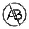
First of all, my current branding:

Website Arron Barnett | Graphic Design

AB2.jpg


And now two of the possible logos I came up with:

abhex2.jpg
abhexline2.jpg


Do you prefer the current logo/style or think one of the new ideas would be better?
Do you have any suggestions or pointers?


Cheers

Arron
 
I like both to be honest though I think the original will remain the most legible at smaller scales. I actually really like the identity in the square. Can you not just apply a gradient or background to that to add a bit of visual interest?
 
Thanks, to be honest though at the moment I only really use the version in the square for social media, most of the time I use black on white.
I might have a go at doing something with the square background then for comparison.
 
Your original logo is far superior. It it fine as it is and I wonder why you want to change it?
 
Part of my worry is that out of context, my current branding doesn't look inspiring or creative and I feel something with a slightly less direct logo and some more colour would convey what I do more efficiently. For example currently on a business card if I removed the words graphic designer, would it be easy or hard to tell what I do?
 
Part of my worry is that out of context, my current branding doesn't look inspiring or creative and I feel something with a slightly less direct logo and some more colour would convey what I do more efficiently. For example currently on a business card if I removed the words graphic designer, would it be easy or hard to tell what I do?

Yes I see your point. Whilst I agree with you, as I do feel it's vitally important for a logo to clearly convey what it is you do, I think most people will assume they are initials and then look into what the initials stand for and what business it is. So in a sense you are kind of drawing your audience in to want to know more about 'AB.' I don't feel your new logos are more inspiring or creative and from a far would not be seen as letters but more as a symbol of an unwanted image if you get my drift...
 
Honestly mate, there's nothing wrong with your current logo. It's clean, simple and makes sense. I've been going on three years without a proper logo, just my name in a certain font, and it's not affected business. Plus, you should see how dull and out of context my business cards are.

Have you thought about using your logo as a crop device and placing some kind of background 'inside' it, like this – http://37.media.tumblr.com/tumblr_m4w580Ke0G1rq7ngfo1_1280.jpg

That might give you something new to explore.
 
Have you tried putting the original logo in a coloured hexagon similar to the first attempt at the redesign? If you want to inject colour and appeal, then that'll be just as effective as the two designs you've shown us here (honestly, will admit, only the original does it for me).
 
Yeah thanks for the feedback! It seems everyone agrees that it's pretty strong as it is. I must just be getting restless because I'm so used to seeing it!
I'll just continue to look for interesting ways to work with what I've got. The cropping idea sounds pretty good!
 
Yeah thanks for the feedback! It seems everyone agrees that it's pretty strong as it is. I must just be getting restless because I'm so used to seeing it!
I'll just continue to look for interesting ways to work with what I've got. The cropping idea sounds pretty good!

Yeah I think something interesting could also be done with those two lovely parallel lines you've got going through the middle
 
That's actually something I experimented with when I first designed that logo, but couldn't work it into something I preferred to the logo on it's own. I might dig that version out later
 
AB-Logo2.jpg
3.jpg

These are both ideas I had for the lines when I first designed the logo. What do you think?
I actually made it much thinner than these two in the end as well as dropping the lines and circles as I couldn't make my mind up.
 
Forget about the texture in the logo. Small sizes for business cards and litho print, and saturation in paper, you are fighting a losing battle.

You could get a texture effect depending on the paper. But you really would need samples.


Keep it simple.
 
Back
Top