You are using an out of date browser. It may not display this or other websites correctly.
You should upgrade or use an alternative browser.
You should upgrade or use an alternative browser.
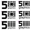
company logo design, comments please good or bad!
- Thread starter fiveye
- Start date
Paul Murray
Ultimate Member
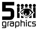
I think there's too much going on in the design. The eye doesn't fit well with the 'people' behind it as it's much more detailed in comparison. Also, the height of the 5 (and the way it's sat below the other elements is throwing the design off balance.
Minuteman Press
Active Member
I quite like the logo. Nice concept.
Tony Hardy
Well-Known Member
Do you think you need the 5?
Kev Clarke
Member
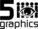
I don't think you need both the eye and the i's.
Katedesign
Well-Known Member
No - one or the other.
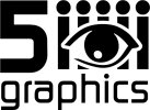
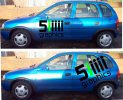
Thanks again for all the help, I think that I'm getting pretty close to a final version. I do think that I need the five as its probably the first part of the logo that you'll see and without it I think the remaining i,s will be confused with little people and as the main advertising is from car graphics it would viewed from different speeds and angles, (ah vinyl graphics back in my comfort zone :icon_smile: ) , I've also coloured the first i green ( I like green ) so it stands out making it easier to read, tried colouring others but with the first one green the logo now hopefully reads fiveye and dropped the actual eye in favour of the iiiii,s.
I business I'm setting up supply's fitted or ready to fit vinyl graphics and rigid signage for shops with graphics applied and I was after a name and logo which was easy to remember. I don't really do a lot of design from scratch ( it shows? lol) as I can and do buy my designs vinyl ready tweak them a little and cut them out, (heathen I know) and to be honest I do work that a graphic designer wouldn't wipe there backside on but hey I love it! vinyl that is and not wiping backsides!
thanks again for all your advice because without it graphic design = head + wall x 20
keith


Kev Clarke
Member
With the spelling of your future business, Fiveye, should the graphic symbol you use not be the human eye.
There is also more significance to this approach and what your company will offer.
I just don't think this concept is quite working for me?
There is also more significance to this approach and what your company will offer.
I just don't think this concept is quite working for me?
spottypenguin
Active Member
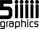
Think you should lose the 5 and the Eye and just keep the 5 iiiii
That 'could' work but the danger is it will end up looking like 5 armless stick men :icon_biggrin:
I think a fairly major problem still lies in the fact that the business name isn't immediately decipherable from the image/text: if you're called '5i' you need to communicate that more clearly, no? Anyone else getting that? A 5 and five i's is, in any case, tautological. Simplify and clarify, I reckon.
thanks for all the comments, I think I began with the idea of trying to create a logo that had all the bells and whistles attached but sort of got lost and forgot the most important job and that's getting the company name across doh. I now have only 2 contenders left, the first one is thanks to gproven simple to the point and I like it, the second has an eye incorporated as suggested by clarke creative but I don't think its working!, see what you think!
View attachment 1425 View attachment 1426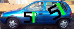
View attachment 1425 View attachment 1426

Kev Clarke
Member
Can't view attachments?
Kev Clarke
Member
Still not conveying the right message or representing the business fully in my eyes (no pun intended).
The green gives it an unwanted element of nature/environment/eco-friendly and the eye is starting to go a bit big brother on me!
Think how the untrained eye will see this logo, if you take the word graphics away, would this logo be recognised as a company offering sign making and graphic services??
The green gives it an unwanted element of nature/environment/eco-friendly and the eye is starting to go a bit big brother on me!
Think how the untrained eye will see this logo, if you take the word graphics away, would this logo be recognised as a company offering sign making and graphic services??
