ryan iddon
New Member
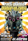
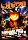
hi guys, im a buding concept artist but have been working for around a year as a promotions officer for a small night club and cafe (owned by the bangor students union) to pay the bills. i basicly go in two days a week and design all there stuff for them from logos, menus, posters and anything that requires a bit of photoshop. i have no previous qualifaction in design and just go by instinct. if you guys could take a quick look at my work and tell me where i need improvement i would be crazy grateful.
everything is made by me, all the images are ether my drawings or a mixture of my drawings and composite imagery and around 2 -3 hours spent on a piece usally less if im rushed. you guys can be as frank as you want its the only way il learn.
ps they are all bilingual due to university poliy and the welsh must allways go above the english which makes them hard to read alot of the time.


cheers
ryan
everything is made by me, all the images are ether my drawings or a mixture of my drawings and composite imagery and around 2 -3 hours spent on a piece usally less if im rushed. you guys can be as frank as you want its the only way il learn.
ps they are all bilingual due to university poliy and the welsh must allways go above the english which makes them hard to read alot of the time.


cheers
ryan