You are using an out of date browser. It may not display this or other websites correctly.
You should upgrade or use an alternative browser.
You should upgrade or use an alternative browser.
Client Logo, looking for feedback.
- Thread starter Siked
- Start date


lukedavies
Member
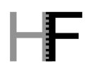
Hi.. although im far from being an expert, my initial reaction was that the joining of the H and F looked a little messy (although youre probably going for that look and feel, judging by the font).. id probably change the angle of the H a little maybe.
Id also have the tagline finishing flush with the E of 'Fire'
Hope this helps")
Id also have the tagline finishing flush with the E of 'Fire'
Hope this helps
S
Squiddy
Guest
It's a nice idea, but you're going to have scaling issues with the small font underneath. You need to make it bigger and possibly consider changing to a more readable font.
Can I just ask what made you decide to cut the H/F diagonally like that?
Can I just ask what made you decide to cut the H/F diagonally like that?
BenJonesDesign
Active Member
ditto with both the above. Generally when it comes to logo design, tag lines aren't put in because of scaling issues, tag lines are only generally used for marketing material. For me the font seems a tad too loose, it needs something stronger to emphasize the the "pow" you want the logo to give.
Pardon the use of expression there :S
Pardon the use of expression there :S
berry
Active Member
richimgd said:Aye but that's no good if you cant read it
'Never put Design in front of Communication" - The BB Book of Life.
JamesBrentwood
Senior Member
I think it looks real nice, but work with the H/F, I think you can still pull it off with a similar feeling but more readability. I had to pause and think about it for a few seconds before I got it. Not typically the response you want.
GilmoreVisuals
Active Member
Practically speaking, maybe you could move the F and H apart, like eveyrone has said, but add a fire silhouette between the two letters. So its still 'meshing' but not over each other and would then be more clear to the eye.
Example of what I mean (obviously, you would use different font, colours, shape etc) not sure what others think...

The tag lines needs to go though.
Example of what I mean (obviously, you would use different font, colours, shape etc) not sure what others think...
The tag lines needs to go though.
S
Squiddy
Guest
GilmoreVisuals said:Practically speaking, maybe you could move the F and H apart, like eveyrone has said, but add a fire silhouette between the two letters. So its still 'meshing' but not over each other and would then be more clear to the eye.
Example of what I mean (obviously, you would use different font, colours, shape etc) not sure what others think...
The tag lines needs to go though.
My mind. Blown.
Ready to have your mind blown? Check this out.
View attachment 1067
(Generated in 0.83758365 seconds)
Yeah, yeah that's what I thought. Allow yourself a moment to take it all in.
Aaaaanyway. My thinking behind this was that you mentioned you want to mesh it together and I'm not really sure how diagonal lines play into meshes as I see them as a rather uniform thing. It's also so, so much easier to play around with the two vertical lines of H and F than trying to find a way to diagonally slice the two letters without compromising readability.
Attachments
GilmoreVisuals
Active Member
Yeah, the idea of the fire meshing them together came from the name and the silhouette you produced, Simon. One or the other (a mesh or fire) could work well.