Cargo Airline Logo Design Take 2

jgcrowther

New Member
Hello GDF people,

I posted last week about what I'm trying to do with this project.

To sum up West Atlantic are a small cargo airline based in Northern Europe, in addition to flying cargo around they provide logistics consultancy to businesses, as well as maintenance and crew to other airlines. This work is not for the company but for my portfolio.

So I came up with two new concepts and developed an old one:

1. WA-Atlas.jpg

2. WA-Bird.jpg


3. WA-Cheetah.jpg


Let me know what you think :icon_smile:.

Cheers!
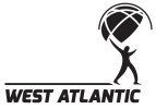
 
Personally i dont think any of the designs are a true reflection of the mission statement,
To sum up West Atlantic are a small cargo airline based in Northern Europe, in addition to flying cargo around they provide logistics consultancy to businesses, as well as maintenance and crew to other airlines. This work is not for the company but for my portfolio.

But if i had to pick one at this stage to develop its definitely the first, number 2 looks a little texas steak house and number 3, whats with the cheetah? is this a reference to speed and agility?
 
Yea the cheetah represents speed, efficiency, diversity and that the airline specializes in not just regular cargo but unique forms of cargo too. The parachute links it to cargo (like dropping cargo out the back of a plane), trust and reliability. It also contrasts the cheetah, a fast animal vs an object which allows for control and maneuverability.
 
I like the thinking behind that idea, possibly the cheetah is the wrong image visually?

Is it possible to repost the designs but at a bigger size so we can see the font selection?
 
i actually like all 3 logos, each has its own way, the cheetah makes me smile as its quirky i like the font from the 2nd logo and i really like the design of logo 1.

if it was me id try the font from logo 2 on logo 1
 
Not trying to ne nit-picky but have you used 'Trace' in Illustrator for those images just that the male shape and cheetah look suspectly like they have been run through Live Trace. I'm not accusing you / saying it is wrong but I think it detracts from the definition or sharpness of the icon.

All that said I would personally work on No.1. By the way what is the image in No.2 meant to be? I take it is a bird in flight with its legs dangling? BUT I kinda see it as a vampire bat :) (sorry)
 
Spotty:
No I didn't use live trace, I did trace over an image by hand though. To be honest I'm not keen on live trace, it makes an image very difficult to work with afterwards - and like you said it is never as sharp as a hand drawn one. It might look like that because of the tufts of hair I added for movement? Heres the image I used: http://images.nationalgeographic.co...os/000/004/cache/cheetah-jump_493_990x742.jpg

Image number 2 is a Eurasian Sparrowhawk. I see what you mean about the vampire bat haha!

My personal feeling is #1 probably says "cargo airline" more so than the others, but I find #3 more interesting :icon_smile:.

Thanks for the feedback so far guys!
 
I wasn't intending any offence jg, I think maybe the pointed arms (meant to represent wings??) make me think it doesn't quite look right. In fact maybe a winged man could be an interesting concept to develop?? - or maybe not, just thinking outloud. :)
 
Have to say I'm a bit unclear on how a cheetah represents 'diversity'... also, dropping cargo from the back of a plane, while not unfamiliar as a concept, is probably the kind of delivery technique you'd expect to find used in a combat or disaster zone which I'm guessing isn't going to be their bread and butter. When you add the two together to make a parachuting cheetah, I can't decide whether it has sinister or Walt Disney overtones...
 
Spotty: didn't take any offense, I'm asking for critique and that's what you're doing :)

Dave : your right, delivering cargo using that method isn't part of their business. But they do provide quick relief to other airlines, by either delivering their cargo, providing planes, crew or maintenance. The parachute isn't meant to be taken quite as literally as you described.

When I said diverse I meant adapting to the situation at hand... I probably should of said adaptability. Furthermore a cheetah is the smallest of the big cats, this airline is small in comparison to other airlines in the regions (Cargolux, DHL, TNT etc), which gives it certain advantages over the others.

If anything it's Warner Bro's, definitely not Walt Disney's style.
 
Back
Top