scruffydave
New Member
I was wondering if anyone can help me identify this quirky font used by sofa.com in one or two places on their website and also on their packaging?
On the website it is used for the title image and also the images that click through to twitter and facebook on their blog page
see the left hand column on...
Comfy Sofas Blog | Latest sofa news and views | sofa.com
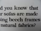
These are one or two shots from the packaging...


The lower case "o" is very irregular (it is biased to the left and its outside circumference is not a regular elipse, unlike its centre)
The lower case "b" has a distinctive left hand slope on the left hand vertical and gets progressively wider towards the top

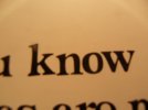
the base line of the letters is not entirely regular either - as the picture above shows te lower case "k" slopes upwards so that its right hand base sits higher than the left hand base of the n
Any help to identify the font would be greatly appreciated, as would any other fonts which give a similar effect
kind regards
Dave
On the website it is used for the title image and also the images that click through to twitter and facebook on their blog page
see the left hand column on...
Comfy Sofas Blog | Latest sofa news and views | sofa.com
These are one or two shots from the packaging...


The lower case "o" is very irregular (it is biased to the left and its outside circumference is not a regular elipse, unlike its centre)
The lower case "b" has a distinctive left hand slope on the left hand vertical and gets progressively wider towards the top

the base line of the letters is not entirely regular either - as the picture above shows te lower case "k" slopes upwards so that its right hand base sits higher than the left hand base of the n
Any help to identify the font would be greatly appreciated, as would any other fonts which give a similar effect
kind regards
Dave