C.V. feedback please on my latest WIP.

Tony

Member
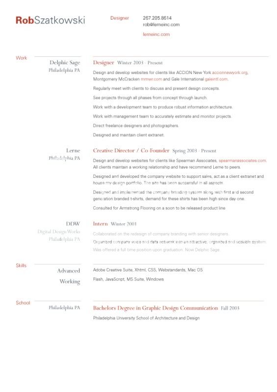
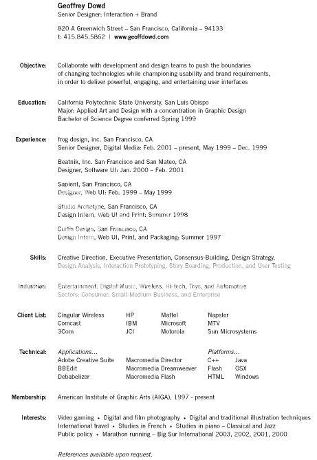
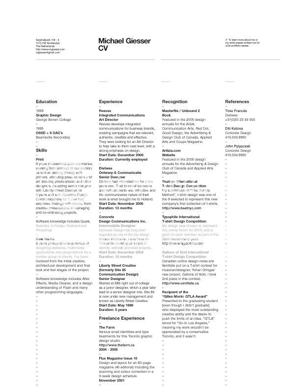
Hey I am looking for feedback on my CV. It is a WIP (work in progress) but would like honest opinions.

Don't hold back but no need to be mean for the sake of it :cowboy:

Or even if you think that it should be a Word.doc. Nothing has really worked so far tbh. My g/f's CV is a Word.doc but she is working so it obviously worked for her. It is a jpeg atm but will be sent out as a pdf, although I am not sure I am doing the saving process from PSD to PDF as the file is either large of blurred.

NewCVPage1v3.jpg
 
Assuming this is for a creative role, position,

The copy is bland and has no impact or punch, also too wordy, as Gordon Ramsey would say "Reduce, Reduce; creative CV DONE."
 
Aye, I hear you.

I was toning it down in the design sense as I thought the other one was too far in the other direction.

Any more suggestions to make it less 'wordy'?
 
definitely make it less wordy.. a lot of employers would give up after the first few lines.
 
No, no, no, no, no. It doesn't work for me.
  • Big blocks of text
  • No clear hierarchy
  • Monotone, bland color
  • Seemingly random image of a flower
  • Skill set = Adobe CS... Does a plumber say skill set = wrench and pipes ?

For me this is very easy. Restart from scratch. I know it sounds harsh but I guess it's fair because a CV is important.
 
Lol, I added the Skill set just before posting up.

Like I said, its a WIP and is bland-er as the others were less so and didnt work.

I have seen the CV examples in another thread but thought they'd be too wild?

Anyone have any other examples or ways to fix it rather than just what is wrong?
 
Try making the text black instead, make some of it in another colour like the titles / dates / companies also make them a larger version of the font.

Always best to keep things as an A4 portrait instead of any other way.. this has to be printed by the employer, remove any background imagery just use some interesting colour / boxing to highlight the most important parts..
 
Personally I don't think you should make your CV too fancy. A simple Word doc. with your education, experience and skillls will do just fine. It can come across as a bit desperate if you have a really fancy graphical CV. Show your design skills in your portfolio instead.

My girllfriend recruits for a design agency and she told me they don't even bother with the CV's if they're not simple Word docs. The reason being that it's mostly recent graduates with no experience who will do fancy CV's to try and stand out.

You've got way too much copy. Employers get a million CV's every day and nobody would be bothered reading all that. Just list what you did in your previous positions, perhaps just in bulletpoint format, and don't write stuff like "I was responsible for opening and closing of the premises" as it doesn't really relate to design, and doesn't enhance your profile in any way. It's fine to tweak the truth a tiny bit on a CV, you need to sell yourself. And you need to elaborate on your skills (as that is one of the most important things). List all the software you use and perhaps write your skill level of each one.

Hope that helps!

Thanks,
Soren
 
I'll answer this as honest as possible

Lose the flower (why is it there?)

Reduce the copy - far too much - one. two sentences at most on each employment / education section.

Don't have it landscape - portrait is the way to go - easier on the eye.

Use headers correctly - make the important text stand out - i want to see where you've worked, studied etc straight away

The border - is it meant to cut off? If so - it looks like an error.


Simple rule with CV's in my opinion - clean, simple, stand out - straight to the point - well designed.

Your CV is a potential employers first impression - and no one with a bad cv ever gets a good job.


And make it a pdf. Word docs are for secretaries and call centre workers.
 
Soren - Thanks man, as always I appreciate your help. Isn't is good though that someone tries on their CV?

Ross - Cheers. We have established that the one I put up will not be used.

...Soren says word.doc, Ross says pdf.... argh.
 
.doc/.pdf - have both ready if you can :)

Recruitment agencies will most probably ask for a Word Doc, design agencies will most probably prefer a PDF, saves them opening up Microsoft Word for Mac (if they have it & assuming they're working on a mac)
 
These a couple of nice cvs in my opinion.

Nice clean simple and straight to the point.


resumerob.jpg


[
geoffdowd_resume-1.jpg


mgiesser_cv_08.jpg


The third one inspired me to redo my first proper cv years ago (before hand it was a mamoth essay!).

Nice columns - easy to read grid system - well laid out text - and makes me to read it again and again.
 
i can't beleive that, and i'm presuming here, you are doing your CV in Photoshop :)

grab a hold of indesign, or better still quark, even for simple layouts it'll save you so much time and it'll add another string to your bow, well, CV
 
rossnorthernunion said:
The third one inspired me to redo my first proper cv years ago (before hand it was a mamoth essay!).

Nice columns - easy to read grid system - well laid out text - and makes me to read it again and again.

Loving that last one! I bet it really helps it to stand out, but in a subtle way :up:
 
Yeah you're right Greg - it does stand out - and it's stood out for a lot of people who've seen it if you know what i mean!

Seen a fair few rips of it mind.
 
I've recently redone my CV after lots of revisions and alterations, a lot of input from professionals and others (thanks berry by the way). Because of the nature of the jobs I am applying for (furniture trade isnt quite as tech savvy as the graphics gang) I wanted to keep it in a very standard format but get as much accross as possible.

I created this: Brendan 'br3n' Patterson - Designer of furniture & graphics - Hopefully any employer will view this version and get a better more controled experience or they can download a .doc/.pdf

One line my current employer said he always liked to read was

I am always enthusiastic to experience further training and I am always open to new challenges
or similar.

He said it always left a good impression, someone who doesnt claim to know everything but is willing an adaptable.
 
Back
Top