ksmith
New Member
Hi guys,
this is my first post - leaving my personal introduction aside. I have decided to put my skills to good use and start my own little freelance business. While I have some skills at web design, my logo work is lacking originality, but maybe I'm too picky - I don't know.
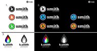
The main purpose of my logo for k.smith design is to be recognizable at a very small size, so it has to be really, really simple. I intend to use it to brand stock graphics and thumbnails for microstock-sites (think of envato and the like).
It is going to be used mainly online, target audience are the creative types, as well as the "ordinary customer" (small to medium-sized buisnesses, bands and people who are driven, positive, passionate).
I am a very ecology-minded guy. I use as little energy needed and I'm soon to move to a 100% green hosting service. I also intend to support green causes with every invoice or a certain amount of my income - I haven't figured out the details though.
Concerning the sketches I did until now:
1. and 2. (which are basically the same) I like best because they are easily recognized, even at a very small scale. The idea itself is not very unique, being only a lower-case letter in a circle. The rightmost versions are also a little too web-2.0-ey, but hey ... :icon_rolleyes:
3. is very vivid but not as legible at small sizes.
While none of these logos represent the "greenness", I want to stay clear of the stereotype leaf.
I guess that's it for the first round. I'd like some :icon_Wall:
Best regards,
kevin
edit: I'm sorry to post this in the wrong forum ... I was shure I was browsing the logo & brand forum. Is it possible to move the thread or should I copy it myself?
Attachments
Last edited:

