You are using an out of date browser. It may not display this or other websites correctly.
You should upgrade or use an alternative browser.
You should upgrade or use an alternative browser.
Branding Critique Please
- Thread starter theking79
- Start date
dot design
Member
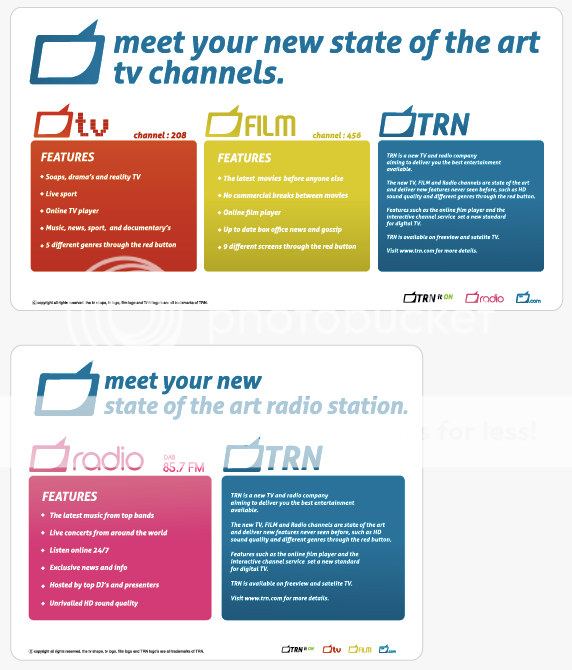
I'd also say its working well too, only thing I'd do (and you have probably done this already) is explore echoing the curves or shapes within the typeface in the TV symbol. The aerial looks a little spikey could it be slightly rounded if or adjusted?
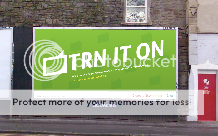
I think the colour palette is working well, love the "TRN it on" copyline. Overall good work!
I think the colour palette is working well, love the "TRN it on" copyline. Overall good work!
S
Steve_jurado
Guest
Maybe consider working on the ariel as it's making the whole thing look like an upside down, rectangular speech bubble.
designer01
Member
Overall, excellent designs. Maybe make the TV wider as it looks like an older TV and perhaps make the frame of the TV thinner. You could do a live trace in illustrator of a TV from a manual/catalogue. The colour schemes are very good, my favourite being the pink and blue colours. Great Ad but I would add an exclamation mark, could be a double entendre!
Regards
Greg
Regards
Greg
designer01
Member
Double entendres could be something like...
She TRNS me on!
He TRNS me on!
You TRN me on!

Greg
She TRNS me on!
He TRNS me on!
You TRN me on!
Greg
dot design
Member
Double entendres could be something like...
She TRNS me on!
He TRNS me on!
You TRN me on!
Greg
Bucket of cold water for Greg please! :icon_biggrin:
Good idea though!
CYoung
Member
Bucket of cold water for Greg please! :icon_biggrin:
Good idea though!
That made me laugh :icon_lol:


