Levi
Ultimate Member
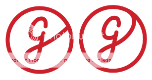
Kind of reminds me of a baseball... the rounded shapes combined with using red don't help lolgcol90 said:


Kind of reminds me of a baseball... the rounded shapes combined with using red don't help lolgcol90 said:
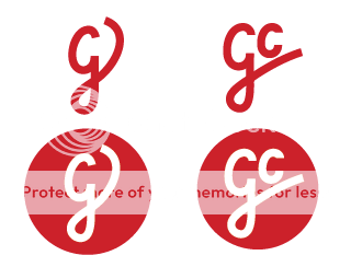

Hi, I know that I'm new and should probably maintaining a low profile here. But I'm also voting for the "baseball" one.gcol90 said:okay, gonna put a hold on the baseball one for now. based this off my signature (well the 'g') but the gc one reminds me of an existing logo for a shop or something. not sure though? might get rid of the circle, it's annoying me now. actually this whole process is. wish i'd been named something with less curvy letters.
anyway, stronger than the previous attempts?
Too much detail.gcol90 said:I'll see if the other grows on me whilst i fiddle.
I think you were closer with this attempt. If you want to lose the baseball look - lose the red?gcol90 said: