Book Cover Critique Please?

I've done all sorts of Graphic Design at some point, but I realised I hadn't done a book cover design. I decided to take two of my favorite plays, and design a cover on the premise of 'if these plays had been books, this is what the cover might look like'. I'd love to hear some feedback!

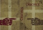
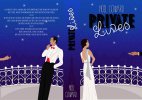
I decided to not only use the front cover, but the back as well to be able to convey the themes of the book better.

The Crucible:
The main themes in The Crucible are witchcraft, witch trials, hysteria, religion, paranoia, blame, and lying. The two hands symbolize blame and 'pointing the finger' (once the book is opened, both fingers point directly at each other. I chose to do one hand in red as that colour usually symbolises danger and warning; I did this to suggest someone is lying. The crosses in the background symbolise Christianity, again, the cross on the back cover is upside down to suggest lying, satanism, unholiness. The font that reads 'Crucible' is heavily based on medieval and religious text style types, but it has been hand-drawn by me. The rest of the text is from Adobe fonts that I thought was most appropriate. The whole simplicity of the design is loosely based on the equally simple designs of Saul Bass.

Private Lives:
The main themes in Private Lives are divorce, separation, division, comedy, irony. Again, I decided to use both pages to capture the synopsis of the book; basically a divorced couple who end up on their honeymoon with their new spouses in neighboring rooms, which is portrayed in the illustrations. The divorced couple realise they still have feelings for each other and elope to nearby Paris, hence the Eiffel Tower on the spine of the book; this is to suggest the spine brings a book together, much like Paris brings these two people together. I decided to use a simple art deco style, wh8ich was popular during the 1930s, which was when this play was written and set. The font is also based on fonts around that time period, but again, it has been hand-drawn by me.

I haven't put them into mock-ups yet because I want to know what you lot thought before I finalise anything or put it into my online portfolio. Sorry about all the writing.
Thanks in advance,
AJ.
 

Attachments

  • The Crucible-01.jpg
    The Crucible-01.jpg
    596.5 KB · Views: 23
  • Private Lives-01.jpg
    Private Lives-01.jpg
    819.2 KB · Views: 21
First of all, the spines read the wrong way! Second, don't put anything important on the back - the front should be the focus for the images. A few typos on the blurbs.

Crucible is ok, though the colours are a bit dull. Maybe try a red background and white out title? Author name too small I think.

Private Lives, you need to sort the title most of all, it's almost illegible. Maybe a pale blue with drop shadow. Move down 'Lives' a bit.
The illustrations need a bit of work, but they're no worse than a lot of covers I see on self-publishing company sites.

The images generally are bit too weak I think, one needs to think outside the box a bit more.
 
Spine direction is actually regional - it really isn't a thing of importance - I've seen them both ways and both are correct.


Noel Coward one it should say "suites" not "suits" and "eachother" needs a space in two places.
The cover is ok - but you only get the graphical message when opened in a spread. I'd consider having both characters on the cover, back to back, with the hands coming in each side, this would convey the message of a couple both having the affair.

Crucible - I don't get witch trial vibe off it at all.
 
Spine direction is actually regional - it really isn't a thing of importance - I've seen them both ways and both are correct.

It's important in the uk (and I presume US too). It depends what you mean by regional. In the English speaking world, if a book is laid on it's back, the title should be the right way up, same with cd's.
The only one of hundreds I'm looking at now that doesn't conform is a French book. I presume it's a library thing.
 
I believe the poster is in the UK, so it would be important to get it correct. ;)

Depends where they're marketing it. At least we know now that different regions do it different ways.

I'd say it's more important to fix the spelling and grammar errors before putting it in a portfolio. You can be forgiven for the spine text direction if you say it's for another region.
Private Lives is set in France.
Crucible is set in the US.

So you can have them different orientations, then for a portfolio piece, if asked - you have this knowledge and applied it correctly to your pieces - which would be a weird interview question. But anyway - at least we know.
 
Spine direction is actually regional - it really isn't a thing of importance - I've seen them both ways and both are correct.


Noel Coward one it should say "suites" not "suits" and "eachother" needs a space in two places.
The cover is ok - but you only get the graphical message when opened in a spread. I'd consider having both characters on the cover, back to back, with the hands coming in each side, this would convey the message of a couple both having the affair.

Crucible - I don't get witch trial vibe off it at all.
Thank you for the advice, much appreciated. I will make a few amendments!

With the Crucible, the witch trials aren't really the main story. It's more about a woman accusing another woman of witchcraft because she wants her husband lol. It just happens to be set during the trials, which is why everyone believes her and goes into mass hysteria. It's more about pointing the finger, and blaming the people they've known for years due to paranoia. (I didn't really want to focus too much on the witch trial aspect)
 
Depends where they're marketing it. At least we know now that different regions do it different ways.

I'd say it's more important to fix the spelling and grammar errors before putting it in a portfolio. You can be forgiven for the spine text direction if you say it's for another region.
Private Lives is set in France.
Crucible is set in the US.

So you can have them different orientations, then for a portfolio piece, if asked - you have this knowledge and applied it correctly to your pieces - which would be a weird interview question. But anyway - at least we know.
I looked at some books I've got and they have different orientations, I guessed it might be regional. I just did it the way I did it because the other way felt odd haha. I'm in South Yorkshire, I've no idea what book spine etiquette is round these parts! I'm actually annoyed about the grammar.. I used bloody grammarly!
 
First of all, the spines read the wrong way! Second, don't put anything important on the back - the front should be the focus for the images. A few typos on the blurbs.

Crucible is ok, though the colours are a bit dull. Maybe try a red background and white out title? Author name too small I think.

Private Lives, you need to sort the title most of all, it's almost illegible. Maybe a pale blue with drop shadow. Move down 'Lives' a bit.
The illustrations need a bit of work, but they're no worse than a lot of covers I see on self-publishing company sites.

The images generally are bit too weak I think, one needs to think outside the box a bit more.

Thanks for the suggestions! For some reason, the colours look different on the images I posted to the ones I chose in AI, so I will admit it doesn't do much justice.

I see what you mean about the illegibility, I'll stick it on my to do list!

When you say 'think outside the box?' are you saying I should make the images less obvious? More abstract?

I know you say not to put any images on the back cover, but from a Graphic Design perspective, could it work?

Thanks again!
 
There isn't a substitute for proofreading - no software can do it.
You're right; sometimes when you've been looking at something for so long, you miss typos! And Grammarly is American so it highlights all British spelling words which is irritating.

I won't rely on it as much in future.
 
Just spotted on the Crucible the upside-down Cruxifiction cross - that could be a problem. I'm not terribly religious, but it might have negative connotations.
 
You're right; sometimes when you've been looking at something for so long, you miss typos! And Grammarly is American so it highlights all British spelling words which is irritating.

I won't rely on it as much in future.

I'm typesetting a book for a local author, and he's made so many mistakes, messed up peoples names, locations, etc. and interchanged details on characters. It must have been read 1000 times and it's still not there yet!

I also offered to print a dissertation recently, and spotted on the front cover where it would be embossed with gold text - the word "Clinically" was spelt wrong, despite scholars reading and reading and fixing and fixing it. The front cover had a mistake.

You're not the only one - that's why proofreaders exist, that's why they are worth their weight in gold!
 
Just spotted on the Crucible the upside-down Cruxifiction cross - that could be a problem. I'm not terribly religious, but it might have negative connotations.
Do you think? I mean, I had considered that, but I thought with the context it's being used in, thought it might be alright.
There's a sort of satanism/demonic/possessed theme in the book; that's what the upside down cross is supposed to symbolise. I can do without any religious backlash though, so if you think it could cause problems, I'd take it out.

I'm not 100% sure to be honest, just saw it and thought maybe it might have backlash.

Actually just looked it up - it's actually the Cross of St Peter, who requested to be crucified upside down - as he didn't feel he deserved to be crucified the same way that Jesus was.

And it's used a lot in movies/marketing/books etc. as a theme for demonic - but it actually doesn't mean that in the Church.

Learning!
Oh, cool.
I knew it was a demonic symbol because it's suppose to be the opposite of christianity. (Literally!)

Anyway, both the books need a rejig, so I might end up scrapping a few of the ideas.
 
Scrap them - keep them. Your call. They are your designs, no brief, it's personal.

I wouldn't use anything like this in my portfolio as it's not a real job.

Most books that have covers are usually done by the publishing houses, it's not really an area you get into unless you work in that industry.
You might get a few local authors who self-publish, but it's no a huge avenue of work in it.

Better to contact a few local businesses who have left their literature and flyers/signs etc. lapse so you can probably get an in with them - by designing a few items and offering it to them to see if you can get their business.
 
When you say 'think outside the box?' are you saying I should make the images less obvious? More abstract?

Not necessarily abstract, just less literal. You only need to Google 'The Crucible Book' to see what I mean, sometimes things can be inferred by using right image.
 
Scrap them - keep them. Your call. They are your designs, no brief, it's personal.

I wouldn't use anything like this in my portfolio as it's not a real job.

Most books that have covers are usually done by the publishing houses, it's not really an area you get into unless you work in that industry.
You might get a few local authors who self-publish, but it's no a huge avenue of work in it.

Better to contact a few local businesses who have left their literature and flyers/signs etc. lapse so you can probably get an in with them - by designing a few items and offering it to them to see if you can get their business.
I think I will put them on the back burner for now. They're not of great importance and I don't want to get into book illustration really. I just thought the more I could do, the better it looked to prospective employers; but if the works crap then what's the point? :ROFLMAO:

I'd rather stick to something I'm good at, rather than trying to branch out and failing.

Another quick question:
You said you wouldn't put anything in your portfolio if it's not a real job. Well, I have no choice but to put fictional businesses etc into my portfolio because I haven't gotten a job in design since leaving Uni yet. What do you suggest?

(I have a few old briefs from previous tutors that I'll be working on, but again, it would be fictitious)
 
Back
Top