Rhonda
Senior Member
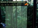
I can't believe I'm actually showing this, normally most artist are their own worst critics and I think that at the moment, this looks like utter crap, (but maybe has alot of room to improve). But, I thought I would design a blog look, style. I had my own website once back in like 2001, that I designed using Photoshop and the ancient GoLive. Now, this is just for a bit of practice, I was trying to think of things that I at least had not ever seen out there as far as blogs today go.
So having said that I'm open to thoughts, advice or anything. Be truthful but sincere is all I can ask you. Some points I already was thinking Obviously some better more eye pleaseing font. Also the side bar, maybe for widgets, could be broken up into smaller boxes? Finally do you think the middle should be a solid color field for text to go on?
So having said that I'm open to thoughts, advice or anything. Be truthful but sincere is all I can ask you. Some points I already was thinking Obviously some better more eye pleaseing font. Also the side bar, maybe for widgets, could be broken up into smaller boxes? Finally do you think the middle should be a solid color field for text to go on?