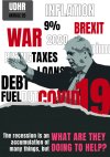
Billboard/poster design

<Hannah>

New Member
Hi everyone!
I am submitting 2 contrasting designs for a uni project and would really appreciate it if you could give me some constructive feedback. What you like, what you don't like (fonts, colours, composition, concept etc), and what you would change if you were doing it yourself?

Thanks in advance!
Hannah xthebill-01.jpgthebreadline-02.jpg
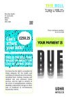
 
They are both a bit of a jumble, visually, which makes it difficult to understand the message you are trying to get across. The first one just doesn't work imho, I think it
needs to be a photo or illustration of a letter or letters sitting on a table for instance.

Think about what your message is, then think how you can depict that message in a SIMPLE and bold way, either visually or typographically, or both. No-one knows what UDHR stands for,
but they know what Human Rights are. On the second one your headline is tucked away at the bottom and not impactful enough. (What are they doing to help YOU?!)
Do a bit more research for inspiration if you need to.
Thank you so much this really helps!! :)
 
Sorry, here's bit of context.

The brief is set by google fonts and HMCT who are asking students to...

"Create a typographically-led campaign based upon or expanding the Articles of the UDHR as a call to action or awareness. Choose an issue that compels you, and makes you care deeply. No matter our origins or where we live now, we should all have access and rights to: education, right to choose, breathe clean air, freedom, justice, etc. Bring these issues to life in a way that is engaging for your audience. You must use Google fonts in your design."
 
Bit hard to comment without any context....
Sorry, here's bit of context.

The brief is set by google fonts and HMCT who are asking students to...

"Create a typographically-led campaign based upon or expanding the Articles of the UDHR as a call to action or awareness. Choose an issue that compels you, and makes you care deeply. No matter our origins or where we live now, we should all have access and rights to: education, right to choose, breathe clean air, freedom, justice, etc. Bring these issues to life in a way that is engaging for your audience. You must use Google fonts in your design."
 
Back
Top