You are using an out of date browser. It may not display this or other websites correctly.
You should upgrade or use an alternative browser.
You should upgrade or use an alternative browser.
Back to what I'm good at
- Thread starter bigdave
- Start date
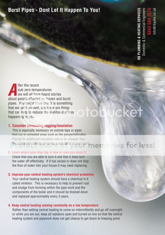
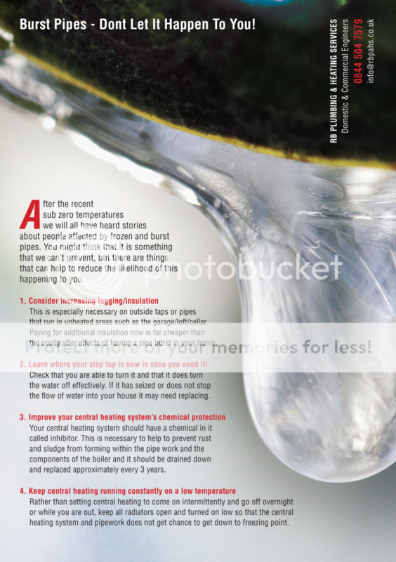
Couple of things: there's an en dash/hyphen issue in the header (do people bother with that one anymore? - header could be more prominent too, perhaps?) and I personally dislike double spaces at the end of sentences (which I think is an old typewriter convention). Also, isn't the red text at #1 bigger than 2-4?
bigdave
Well-Known Member
The arguments I had with the proof reader about the actual design, I thought it best just to let her have the text how she wanted. but you're right, about the dash and the double spacing, I hate it too!
In fact Ive removed the double spacing as the proof reader wont see it again before it goes to press so sod her! :icon_biggrin:
As for #1. BUGGER! I hadn't noticed that! thanks for spotting it! :icon_blushing:
In fact Ive removed the double spacing as the proof reader wont see it again before it goes to press so sod her! :icon_biggrin:
As for #1. BUGGER! I hadn't noticed that! thanks for spotting it! :icon_blushing:
SparkCreative
Member
I tend to prefer hanging punctuation - so range the copy left and let the numbers hang further left. It's just a personal preference but I'm not a fan of indented lists. You don't really need the full point after the numbers either.
Big pet hate of mine - Headings Don't Need Every Word To be Capitalised. It's unnecessary and it looks untidy.
Other than that, looks ok to me.
Big pet hate of mine - Headings Don't Need Every Word To be Capitalised. It's unnecessary and it looks untidy.
Other than that, looks ok to me.
Toppers
Member
It may just be me but i'm finding the long drip of the pipe along with the long Oblique typeface slightly
off putting. Maybe it's because the grey text doesn't stand out from the blurred background. Maybe try a slightly more condensed version to add a little contrast and increase the leading a little to match the rotated contact details on the top right hand side.
off putting. Maybe it's because the grey text doesn't stand out from the blurred background. Maybe try a slightly more condensed version to add a little contrast and increase the leading a little to match the rotated contact details on the top right hand side.

