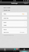
I wouldn't say there's anything particularly wrong with the design, it's just a bit boring.
P.S. The more involved you get in the community, the more feedback you will receive
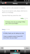
oh look... another iphone conversion.... seriously it looks like you've taken the iphone screen shots (literally looking at the status bar up top) and stuck them here saying they're for android.
Doesn't fit in with the holo ui design language either in my opinion
This site uses cookies to help personalise content, tailor your experience and to keep you logged in if you register.
By continuing to use this site, you are consenting to our use of cookies.


")