Am I heading down the right path?

bigdave

Well-Known Member
Not so much after a critique but as this is the first fully hand coded site ive made, I wouldn't mind some feedback or ideas on this as a 1st draught of the home page for Emma's site....
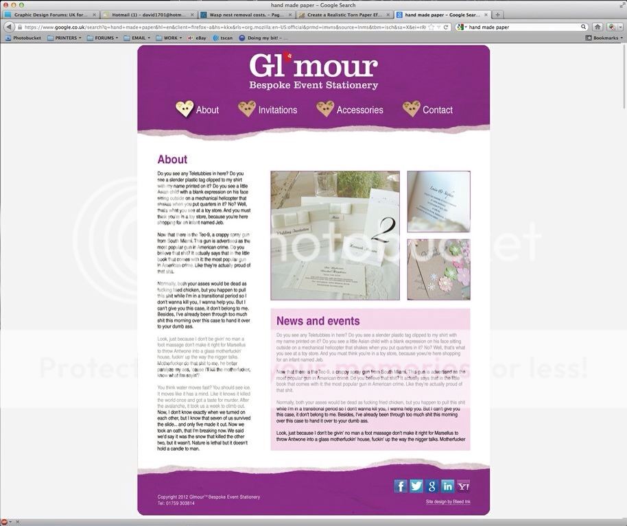
A7DDA61E-236C-4DBC-86DC-7B51F81A0BB7-735-0000016B449F8604.jpg


As a slight footnote, I'm thinking of the news/events pink box being a little more creative (ie; handmade paper background & scroll bar).
 
Is it wrong that I'm enjoying this learning curve so much I'm actively seeking ways to make it more complex in order to problem solve?!


.... Next up,... HTML5 :icon_biggrin:
 
well without looking at code, i would say it looks good so far only thing i would point out though is your text, make it justified :) and perhaps add a bg colour to the about text field like you have to news and events, also are your links images or text?
 
As of yet this is just a photoshop mockup but all links will be text (well, as textual as a heart shaped wooden button can be, lol).
 
Have you considered to how have that "torn paper" effect for the header and footer load up while keeping the file fairly small? It's something I've not looked into and wondered if you had :)

Did you use a Grid System for it?
 
As a slight footnote, I'm thinking of the news/events pink box being a little more creative (ie; handmade paper background & scroll bar).
Don't go too overboard with this, I've seen people go too far with it and it can instantly date a design. A simple, off-white textured paper background rather than the grey could be enough.

If this is the index/landing page, I'd suggest putting more emphasis on the images. Make them bigger and show visitors what she can do as soon as they hit the page, possibly by way of a slideshow.

I'm not a fan of the navigation, they don't look enough like navigation links. Maybe try separating them from the header with a line above and below perhaps?

Also, custom/uniform social media buttons (like these) would look better against the purple background.

Love Samuel L Ipsum placeholder text by the way :icon_biggrin:
 
Have you considered to how have that "torn paper" effect for the header and footer load up while keeping the file fairly small? It's something I've not looked into and wondered if you had :)

Did you use a Grid System for it?

Good question...

Header (including logo) is 200kb which might be considered a bit hefty but a solution would be to just use the bottom 50px of the torn edge and have the logo and navigation on a background colour with the torn edge butting up to it? Doing that would reduce the torn edge down to 57kb and the logo to 13kb (70kb total). I'd imagine a similar solution would work for the footer.

Grid? whats one of them? :icon_biggrin: so far, my only grid is as I would for printed document with gutters and margins being of equal size etc.. This is only a first draft of the site and I know I need to get a grid set up that will work for all the pages & their content (no point having a full left hand column with 2 paragraphs in lol).


Don't go too overboard with this, I've seen people go too far with it and it can instantly date a design. A simple, off-white textured paper background rather than the grey could be enough.

If this is the index/landing page, I'd suggest putting more emphasis on the images. Make them bigger and show visitors what she can do as soon as they hit the page, possibly by way of a slideshow.

I'm not a fan of the navigation, they don't look enough like navigation links. Maybe try separating them from the header with a line above and below perhaps?

Also, custom/uniform social media buttons (like these) would look better against the purple background.

Love Samuel L Ipsum placeholder text by the way :icon_biggrin:

Thanks for the feedback. The content is the important bit and so I don't want to over clutter anything or render it illegible so will remember that when addressing the news section of the page.

Something that does keep coming back to me is that the left hand column requires a large amount of text to fill it so perhaps re-ordering the page to allow a smaller blurb and news section would increase the opportunity for visuals. I will certainly look at slideshows.

As for the social media buttons, theyre just the first ones I came to on another site so are little more than a placeholder.
 
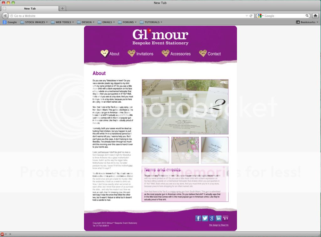
More tinkering last night....

MOCKUP2.jpg


I'm now working towards a grid layout that I'm happy with & that's going to alleviate hair pulling moments when building the site (ie; making the pages 1000px to help with %'s). I'm not 100% sold on the vertical spacing yet though...
 
Last edited:
That looks great for the website. I think the navigation buttons will work fine. I wouldn't make the type justify... it makes it harder to read.
 
Ahhh! But you don't have the same control on the web as you do in print...and you could be left with other problems! Rivers....
 
Back
Top