Album artwork...

I've been asked to do a cover for a collection of tracks coming out soon.
It is electronic music with a "spacey", different sound. I was asked to do something a bit weird and thought provoking and different.
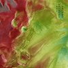
I found this image which is a projection of the surface of mars. I really like the textures and colours but I'm not quite sure how i could use the image in order to take it further and make it work as a cover.
This is just a draft/play around that I did so that you can get the drift.

Help/ideas/opinions much much appreciated.
Thanks!
 

Attachments

  • cover eg1.jpg
    cover eg1.jpg
    95.2 KB · Views: 59
after some more work and thought I came up with a completely changed version.
Might redraw the contours again because I cant help but see a little face in the middle that is staring at me
It could also maybe do with some colour

Let me know what you think!
cheers
 

Attachments

  • cover 1.1.jpg
    cover 1.1.jpg
    83.9 KB · Views: 39
after some more work and thought I came up with a completely changed version.
Might redraw the contours again because I cant help but see a little face in the middle that is staring at me
It could also maybe do with some colour

Let me know what you think!
cheers

To be honest, I didn't really know what to say about the first version, but I can say I prefer the second version. I kinda like that there are some faces and other shapes to be found in there, something to make your imagination go a little wild on, which kind of fits the brief of something to provoke thought I guess. I still don't think it's quite there in terms of design because I don't like the way the black background the logo is sitting in cuts through the lines - I would like to see the logo incorporated into the design a little better :D
 
Agree with the above with the difference that I also really like the image in v1; I don't really know what to say about it in the specific context of album cover artwork (that's pretty much carte blanche, isn't it?) but the picture's great - I thought it was a Francis Bacon until I read the post.
 
I dont know if this response is a little late...however I really like the first one. The image is much more thought provoking and spacey than the second image - which I do like but find it could be kind of generic? Anyway, I love where you where going with the first image and I would like to see it in maybe slightly different colours and with various text placements. I hope this is helpful :\
 
Back
Top