Sophie Lep
New Member
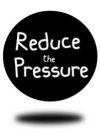
Hi, these are logos for a charity based in Hackney, London.


The charity aims a decreasing violent crime among young people in London.
The name "Reduce the Pressure" is based on the idea that the charity will try reduce the pressure exercised by some young people onto other leading to acts of violence.
I am struggling to get the client to accept any logo. I did several other logos as well. I thought this 2 are the best, but I need feedback. please be constructive.
I like the R and P (as a shadow, at an angle) because they look elegant, however, it also looks very serious and a bit like "RIP", Rest in Peace, which does not sound appealing.
thank you.