Advice Needed - 'Busy Text'?

SteveDub

New Member
Hi,

I have been told by a client that they like my design on a Flyer I have produced, although they say the text needs to be less busy! I get what this means in it's simple form but they have given quite a bit of copy to fit onto a small space. So my question is could this include getting rid of colours I have used and also Bold wording as well to make it 'less busy'? Or do you think they litteraly mean spread it out a little?

Cheers for looking,
Steve
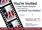
 
I have been told by a client that they like my design on a Flyer I have produced, although they say the text needs to be less busy! I get what this means in it's simple form but they have given quite a bit of copy to fit onto a small space.

Clients are priceless!
 
I don't think 'busy' is quite the right word but I'm afraid I don't think the typography here is good: the font isn't very nice and there's no real coherence to the sizing, spacing or alignment.
 
I don't think 'busy' is quite the right word but I'm afraid I don't think the typography here is good: the font isn't very nice and there's no real coherence to the sizing, spacing or alignment.

I agree with Dave. There are a few fonts being using here and not great ones although I wouldn't necessarily agree with their description. I think they are saying there is no focus point and its a bit all over the place. The layout is a bit unorganised although I wouldn't put that down to the text alone.
 
I agree with the comments made above. Look at your font selection, leading and kerning.

The only place it appears to be busy is in the photo film which i'm assuming is down to the size of the image posted not the original. What is the size - A5?

If you are unsure about what the client means by busy, go back to them ask them?
 
There's a lot of layout issues with the whole piece I think Steve. There's definitely room for improvement. Even just aligning certain parts of the text is going to work more effectively than what you've got at the minute.

I appreciate "Ann Richards' Texas Documentary" is a kind of "set in font, set in stone" type logo that shouldn't really be tampered with, but is there no way at all you could break that into two lines as it looks very very crammed in there?

Keeping with this idea, whilst trying something different, you could create yourself a nice textured background, Texas related, run with the film strip thing, make it all black and white and apply some really lovely typography over the top of it? It depends on the target audience though I guess.
 
Back
Top