Hello all,
I was searching around the net for design ideas for a motorsport logo and have stumbled across your forum which seems very active and helpful in providing style and design advice to people. So I hope to pick your collective professional brains if I may.
I'm in the process of setting up a national club level Speed Championship for the car club I'm a member of. We are a lotus enthusiasts club called SELOC that is primarily web based SELOC | Lotus Enthusiasts Club (please feel free to comment on our website).
I've been looking at logos from both national and international race series and have been hoping to take design and style cues from them and incorporate them/take their the theme and apply it to our current logo.
I'm not particularly arty so I'm asking for as much advice as you're will to give in order for me to then try and get a product created.
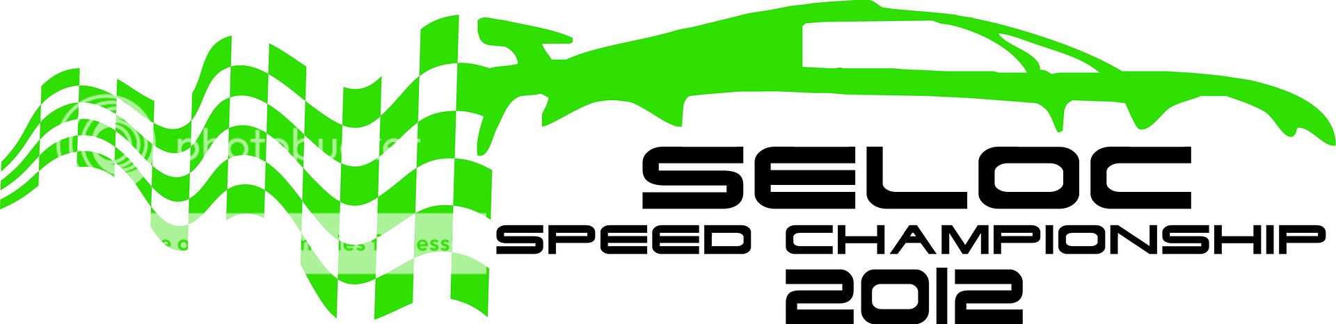
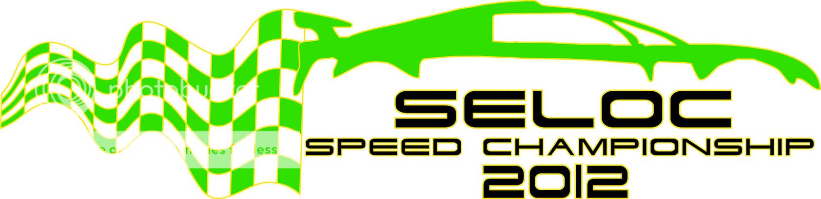
I'm want to get the title of our series 'SELOC Speed Championship' included along with the year of the series which can easily be altered.
Our club logo takes influence from Lotus cars colours of green and yellow:

We have no official ties with lotus cars so cannot use their logo.
Current lotus race series run these logos, and whilst we have strong links with the organisers of them we again aren't involved in an official capacity. But I do like the design of them.


A design of the NASCAR logo is another influence I'd like to incorporate:

Which elements of each do you think will work with our current logo and how do you think they should be applied?
Thanks you for your help!
Kind regards,
Keith
I was searching around the net for design ideas for a motorsport logo and have stumbled across your forum which seems very active and helpful in providing style and design advice to people. So I hope to pick your collective professional brains if I may.
I'm in the process of setting up a national club level Speed Championship for the car club I'm a member of. We are a lotus enthusiasts club called SELOC that is primarily web based SELOC | Lotus Enthusiasts Club (please feel free to comment on our website).
I've been looking at logos from both national and international race series and have been hoping to take design and style cues from them and incorporate them/take their the theme and apply it to our current logo.
I'm not particularly arty so I'm asking for as much advice as you're will to give in order for me to then try and get a product created.
I'm want to get the title of our series 'SELOC Speed Championship' included along with the year of the series which can easily be altered.
Our club logo takes influence from Lotus cars colours of green and yellow:
We have no official ties with lotus cars so cannot use their logo.
Current lotus race series run these logos, and whilst we have strong links with the organisers of them we again aren't involved in an official capacity. But I do like the design of them.
A design of the NASCAR logo is another influence I'd like to incorporate:
Which elements of each do you think will work with our current logo and how do you think they should be applied?
Thanks you for your help!
Kind regards,
Keith


")