Advice and Help about a logo

RedLion

New Member
Hello everyone.

I hope you are all fine. I'm currently designing the logo for my technological gadgets shop called SmartGet ( selling smartwatches, portable fans and others ). After some sketches, I went for the result you can see below. I wanted to know what you guys see when you look at the logo, how it makes you feel in general and what you generally think about it and the "color variations". Don't hesitate to be harsh and direct and thank you for your feedback.
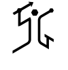

Logo_SmartGet.pngLogo_SmartGet_with_Brand.pngLogo_SmartGet_with_Brand_Red.png
 
Do some more sketches. It's a classic example of getting fixated on one idea when it's just not going to work. Why would you want something that looks like
a stone age man as a logo. It certainly doesn't say 'gadgets' to me. If you really need a logo, just Google 'SG logo', there are lots that keep it simple and smart.

I think you'd be better having just a logotype and making the S and T at the ends extend with the blobs at the end (don't know the technical term). Find a nicer, technical font, maybe rounded.

Personally, not keen on the name, unless it's been chosen ironically - 'no-one likes a smart get'.

Thank you for your feedback. In fact, Smart Get is the short for Smart Gadgets and also let me use the phrase "Be Smart, Get Prepared".
 
Smart Gadgets - and you came up with Smart Gets - doesn't really say gadgets though does it?

Better off using Smart Gadgets and logo research via trusty google shows a few already in use.

And you might be in some sort of trouble with Get Smart - a TV show that ran that had the agent using different gadgets.

Personally, I'd go with SmartyMcFly.
 
Smart Gadgets - and you came up with Smart Gets - doesn't really say gadgets though does it?

Thanks for your feedback, well appreciated. Concerning the name, I also wanted to be open with it so you could also say "Define Smart TarGets", as I will sell mainly smartwatches for helping with health goals.
 
I'd still err on the side of caution with Get Smart brand out there (TV/Movies) and Smart Get.

Anyway - others have mentioned it doesn't sound right - but you're still happy with it.
 
This is probably something that only comes to my mind as it's probably just a local (Yorkshire/Sheffield) thing.

"Git" is pronounced "Get" and a smart arse would be called a "clever get" so to me Smart Get has a kind of different meaning, but like I say... It's just a local thing. ;)

are-you-local-jpg.7260
 

Attachments

  • are-you-local.jpg
    are-you-local.jpg
    78.1 KB · Views: 60
This is probably something that only comes to my mind as it's probably just a local (Yorkshire/Sheffield) thing.

"Git" is pronounced "Get" and a smart arse would be called a "clever get" so to me Smart Get has a kind of different meaning, but like I say... It's just a local thing. ;)
um out my way git is pronouced git.. or maybe on a rare occassion 'giieet' (think drawn out git)

As to the design... all I can see is the man has a broken leg... you know how you see the comedy dead body outline where one leg is bent the wrong way... that is what I'm seeing due to the way the G has the 'leg' kicking
 
I'd still err on the side of caution with Get Smart brand out there (TV/Movies) and Smart Get.

Anyway - others have mentioned it doesn't sound right - but you're still happy with it.

Well, I have reason to back up my choices too. I don't focus only on the negative points. I think there are also positive ones that could be interesting to exploit. I'll be cautious concerning the brand/TV Thing, BTW.

This is probably something that only comes to my mind as it's probably just a local (Yorkshire/Sheffield) thing.

"Git" is pronounced "Get" and a smart arse would be called a "clever get" so to me Smart Get has a kind of different meaning, but like I say... It's just a local thing. ;)

I see. There could be an amalgam between "Get" and "Git". Well, I'm willing to take the risk.

um out my way git is pronouced git.. or maybe on a rare occassion 'giieet' (think drawn out git)

As to the design... all I can see is the man has a broken leg... you know how you see the comedy dead body outline where one leg is bent the wrong way... that is what I'm seeing due to the way the G has the 'leg' kicking

Oh Well. I wanted to represent someone who prepares himself before launching a spear. So people effectively see the man but with this and the fact @Wardy told me it looks like a "cave man" ( definitely not modern ), I think I need to rethink this.
 
I'd go with the others, in Ireland you'd say Smart Get to a smart arse. Didn't think of it before though, but valid point.

Yes, on the artwork itself - caveman with a spear is not very tech or smart etc., also another valid point that I'd echo on reflection.

Maybe if it was like
<space>Smart
gadgets

So the Smart is aligned over the gets -

And a caveman trying to break into a gadget or over the gad or something?

More like a sport thing, like in the javelin throw Olympic discipline. It seemed to me the logo captured the moment the athlete prepare himself before throwing the javelin ( The idea of "Getting Prepared", coupled to the ideas of dynamism, performance and aiming for (smart ?) targets ). When buying my watches and other gadgets, it's like preparing yourself for a better you, a "you" aiming for healthy smart targets in your life. That was mainly the idea.

I decided to rework the logo and to simplify it:

Logo_SmartGet_v2.png
 
Going to be blunt so you get it.

It is shit.

It doesnt look like a sports person. It doesnt look like a javelin, it is too short. It isnt aiming at anything.

It looks like a demented caveman about to club some poor woman over the head and drag her back to his lair.

The name is terrible.

Everyone has told you this in a nice roundabout way, I am telling you bluntly and honestly.

It is not to hurt you but to help you. You came for advice and you are ignoring it.

There is honest critique.

Start again. Pen and paper. Get away from the computer.

Next set I want to see pencil sketches of 9 different ideas.

That means sketch 81 different ideas and pick 9 to show here that you are happy with.
 
Going to be blunt so you get it.

It is shit.

It doesnt look like a sports person. It doesnt look like a javelin, it is too short. It isnt aiming at anything.

It looks like a demented caveman about to club some poor woman over the head and drag her back to his lair.

The name is terrible.
That's what I wanted to say but was trying to be tactful!

Forget about the logo. I googled the first half dozen 'gadget websites' and only a couple had logos, and very simple ones at that.
If yours came up when I was searching, I wouldn't click on it. It's not a nice design, it's far too big and the font isn't friendly enough.
You're talking to people on here with many, many years of experience. Just get online and do a bit of research, take those blinkers off
and concentrate on making a nice website.
 
That's what I wanted to say but was trying to be tactful!

As much as I hate being as blunt as that - sometimes I get the impression that the feedback isn't sinking in.

Unfortunately, I just had to say it like it is.

I'm sure this can be a great logo and a great name and a great thing - but it is nowhere near anything like that right now.
 
Yeah follow the blunt opinion, it's the most accurate...

Why are you trying to flog a dead horse.... that design is never going to work.

Not to mention... what the hell has someone throwing a spear/javelin got to do with smart devices. Your own logo has more 'tech' feel to it than this does.
 
Going to be blunt so you get it.

It is shit.

It doesnt look like a sports person. It doesnt look like a javelin, it is too short. It isnt aiming at anything.

It looks like a demented caveman about to club some poor woman over the head and drag her back to his lair.

The name is terrible.

Everyone has told you this in a nice roundabout way, I am telling you bluntly and honestly.

It is not to hurt you but to help you. You came for advice and you are ignoring it.

There is honest critique.

Start again. Pen and paper. Get away from the computer.

Next set I want to see pencil sketches of 9 different ideas.

That means sketch 81 different ideas and pick 9 to show here that you are happy with.

OK. In this case, I will work on it and get back with new ideas.
 
Think a little about visual contrast. Big vs. Small, Thin vs. Thick ect. Right now everything has the same "Visual weight" to it. Then when you have a design YOU like start taking things away from it one by one until you cant remove anything else. Think about how the logo will look reproduced at different sizes from a postage stamp to a billboard. It should be legible at any size. Also dont get stuck in the trap that your logo needs to be metaphor for your business. Dont try to sneak a smartphone in there because that is something you happen to sell.

Dont worry about harsh criticism. I have been doing this my whole life and I still get creative directors who look at my first drafts and say "This is shit, do it again!" :)

Edited to say I don't have a problem with the name. It is what it is. If selling smart technologies is your business I think it makes sense. Don't know where you are but in the States you wouldn't run into any kind of copyright issues with this name.

Good luck, look forward to seeing more iterations.
 
Back
Top