A6 flyer design feedback

Dumb_pencil

Member
Hi,

Its been a little while since I last posted in this category, I have missed all your brutally honest feedback.

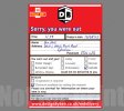
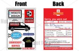
I imagine copyright will be the big issue with this design, however I have changed the logo to read Royal Mall instead of Royal Mail, please let me know what you think?

Thanks in advance.flyer-proofs.jpg
 
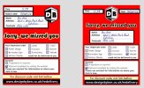
I think it's best to be honest since you've asked for help. The Royal mail thing seems a bit disjointed and doesn't really serve a purpose. I think it would be a stronger approach to use the back to convey the costs / details of your service and the front to demonstrate real examples rather than vector images as people react a lot better when they see the real thing.
 
The royal mail part is to get noticed, the last set of flyers were designed to look like parking tickets, as they were geared up to be putting on white van's to do van printing. This one is to go into shops and be left at places near by, I hope the royal mail part will be seen as a funny thing that will get people to look at the flyers, the other side is geared at seeing the services within 5 seconds of looking. I do agree real photo's would probably have a stronger impact but I thought the vectors might keep it light on the eyes, photo's could be a bit more distracting and not work so well?
 
Whilst I really like the idea (it would certainly make me look twice rather than put it straight in the bin which is what I do with most flyers that come through the door), I think you may run into problems, possibly even complaints because you have made it look SO identical to the Royal Mail missed mail cards that people in a rush might not even read it and just take it straight down the post office.

The front however really does do anything for me, it doesn't showcase good graphic design skills, the typography is poor and it looks dated - sorry!
 
I'm sorry to be harsh but I think that the front is really lacking. It looks disjointed and dated. Its bland and looks like a draft of an idea to be explored. So sorry but it's better you know than going to spend money on printing something that isn't going to do you any favors.

Also the Royal Mail part is far too close for comfort I'm afraid. I'm not sure if the image above is a finished piece but to me the Royal Mail image looks like you've scanned the actual card and changed parts of it?

Okay, for the constructive bit- If you really want to go down the road of the Royal Mail 'Missed you' card I would consider picking 2 elements from Royal Mails Design. For example the placement of the 'Sorry you were out...' part and the layout of the top of the form? But most importantly design it yourself. I would stay clear of red and make it your own. Don't use the Royal Mail copycat logo use your own, Choose your own colour scheme and typography.

For the front page design I think you need to refine this idea, develop it further. Try and unify your vectors and your colour scheme. But before you do google like mad for inspiration even if its just getting lost in behance or the creative review website for an hour or so. Everything above feels a bit stifled and constrained not sure if this is a lack of technical skill, creativity or inspiration.

Once again I am sorry if you are offended but I thought I would be honest and after all its just my opinion.
 
It's a great idea but I just don't think you can do it. Royal Mail would sue your arse off especially as Linzi says people in a rush / not paying attention may rush off to the sorting office with it - you'll also then get public Joe shouting at you for their wated time / petrol / bus fare.

I know the front is based on a poster you worked on a while back, sorry to be negative / harsh but I really don't think it does you any favours in terms of showcasing graphic design.
 
Unlike last time, I'm actually rather happy you guys don't like it, as hopefully I can improve the design. To be honest the royal mail idea is rushed as I wasn't sure if I would have a leg to stand on. I think I will change it slightly, original thought was make the background black instead of red, however, I will play around with replacing the royal mail logo and tweaking it slightly.

In regards to the front, I have a very similar design that was printed for some posters and wanted to keep the design the same, if you could tell me which parts need to be changed and possible how you think it to may look better, I would be all ears, but I don't think there was much apart from changing the colours and vectors?

Thank you for your comments, working as a freelancer means I miss out on people's around me in the office, so don't hold back... but please don't forget to show a little bit of love when you see improvements or a design idea that you like! ; p
 
It's not our job to tell you which parts need to be changed in order to make the front look good, a few people have said similar things about the front - that it doesn't showcase good graphic design skills, and in my experience, when people say this there is often so much wrong with it it's difficult to know where to start. It usually means going back to the drawing board for the designer, and doing some research into what constitutes good design. Get some magazines, pick apart the reasons some things look better than others, get a really good understanding of how things relate to each other on the page, how typography can make a huge difference to a design, how colour has an emotional impact and how visually something guides your eye around the page.

However, I will start with just a few pointers to get the ball rolling:

Embroidery service - the gap between the two words is huge
I think you have gone for one of those DIY kit looks for the front where you pop off the bits too assemble something, but I'm not sure of the connection to design services?
The fonts used need some work, at the moment I can't decide whether there are too many different ones going on or not enough, I'd try out some other options
The images of the van and the t-shirt look like they came straight off a stock image site - even if they did, make them more your own
The colour scheme does not look well considered, it looks like default swatches that haven't been tinkered with in any way to make the design stand out.
If you are to stick with the DIY toy kit idea I think the parts which are meant to be the plastic connections need to be more obvious what they are. When you look at these kits they are usually all one colour, perhaps limit your colour pallet and see what this does to help your design shine through. The 'pieces' would also need to look more like the pieces of the toy. It needs consistency.

Hope this helps, I know it can be a little frustrating when people come back with criticism to a design with not much more than "needs more work" or "doesn't look right" but often we can see that something doesn't look right and we need time to investigate exactly why.
 
Thanks, linziloop,

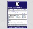
I am working on the front at the moment, attached is design with changes to the back. Hopefully the slight design change will be much better?sorry-re-vamp.jpg
 
No I think you still need to take it away from the Royal Mail look further. Other companies also have this call cards - any catalogues, DHL, Yodel etc. and they all look different. You could still make it look like one of these cards without blatantly copying the Royal Mail design. Your logo plonked in the top middle with the Royal Mall one to the side just looks like a lazy solution to the copyright problem, and still one that will get you in trouble.
 
I can understand what you're trying to achieve but plagiarism is not the way to get yourself business! If you want potential clients to become aware of your brand, you need to think smart and not just try and rip someone else off! Especially when that someone else is a government owned business!
 
You didn't really change it though, you just changed the colour, the deign layout is still Royal Mails. You need to be doing your own complete, from scratch, design layout. It shouldn't take you less than 15 minutes to come up with a whole new design ;)

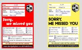
Fair point, changed the design and not the colour.
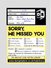
flyer-back-3.jpg
 
Back
Top