You are using an out of date browser. It may not display this or other websites correctly.
You should upgrade or use an alternative browser.
You should upgrade or use an alternative browser.
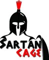
A logo i have been working on....
- Thread starter Efexor
- Start date
Clean up the grunge, think if this was to be t-shirt printed, they'd struggle with that.
Clean up the grunge, think if this was to be t-shirt printed, they'd struggle with that.
yes i agree
Attachments
It's alright.
A friend of mine has a Spartan logo already, and it's stronger than yours... as I did it ... lol
Anyway - it's not terrible, if the client likes it then go for it.
A friend of mine has a Spartan logo already, and it's stronger than yours... as I did it ... lol
Anyway - it's not terrible, if the client likes it then go for it.
JMGraphicDesign
Member
There is a lot you could do with the type to make it fit in better with the overall feel of the logo; at the moment you've used quite a non stylized type but added the grunge effects on top... Why not explore some of the traditional greek-looking typefaces available? I did something similar for a Greek Restaurant Logo it's the 6th one in... I'm not saying it's great but just to illustrate the way you might give this logo an overall look and feel that is more "Spartan"!
PriyeshDesign
Member
If it's possible, could you clean up the edges of the logo like the shield - do you need a shield?
You may want to experiment with serif fonts and perhaps colour?
You may want to experiment with serif fonts and perhaps colour?
There is a lot you could do with the type to make it fit in better with the overall feel of the logo; at the moment you've used quite a non stylized type but added the grunge effects on top... Why not explore some of the traditional greek-looking typefaces available? I did something similar for a Greek Restaurant Logo it's the 6th one in... I'm not saying it's great but just to illustrate the way you might give this logo an overall look and feel that is more "Spartan"!
I will try this, thanks.
If it's possible, could you clean up the edges of the logo like the shield - do you need a shield?
You may want to experiment with serif fonts and perhaps colour?
Priyesh - do you mean get rid of the grunge effect? I do like the shield being there
Last edited:
PriyeshDesign
Member
raw psd file :S
Oh dear, Photoshop is not designed for branding… are you familiar with Illustrator or a vector-based application?
I understand your spartan fellow is hand-drawn or it looks hand-drawn, which means originality to some respect. However when you scale your logo, the edges will look shabby hence why I suggested to clean up the edges, this applies to the helmet and shield.
Interesting choice of font, definitely looks Greek!
The tone of red will need adjusting, professionally are you able to get your hands on Pantone colours?
Apart from that you will have problems with scalability and flexibility of your logo - you may want to attempt to vector your design to save time.
Last edited:
@GCarlD
Well-Known Member
This is not a logo. This is an image with some text.
Saying that, I like how you are colour co-ordinating with the introduction of colour between the image and the text. The text's kerning needs adjusting eg. SAR T AN.
Tracking is a bit too tight.
Whole image needs cleaning up, it's a bit rough around the edges. Way too much drop shadow, too overused. Simplicity and subtlety is key.
This is not a logo. This is an image with some text.
Saying that, I like how you are colour co-ordinating with the introduction of colour between the image and the text. The text's kerning needs adjusting eg. SAR T AN.
Tracking is a bit too tight.
Whole image needs cleaning up, it's a bit rough around the edges. Way too much drop shadow, too overused. Simplicity and subtlety is key.
Im a bit disheartened to hear you say its not a logo, but thanks for the feed back. I will tidy it up.
Can I ask what a Sartan is? Is that a typo?
Surprisingly, it isnt. Its supposed to be a combination of the clients first name and Spartan. I have desperately tried to advise him against this, but he is adamant it stays like that.
Im a bit disheartened to hear you say its not a logo, but thanks for the feed back. I will tidy it up.
On this rare occasion, I disagree that it's not a logo.
A logo, which is an abbreviation of logotype, is from the greek (spartans after all...) which is "logos" which means "word" and "type" which means "imprint", technically, logotype means "word imprint".
Technically a logo can be either text, graphics, or both.
All a logo serves as is an immediate recognition of brand.
Thanks Hank
@GCarlD
Well-Known Member
Im a bit disheartened to hear you say its not a logo, but thanks for the feed back. I will tidy it up.
Don't be disheartened, just simply do a bit of research. Google logos, look and compare the professional logos that pop up, compare them to yours and you will see the changes that need to be made to make it more of a logo.
What you have currently would be good as part of a front cover or title shot of something, but if it is intended to be a logo you have to think about if it will work across the many different platforms and media. Will it work just as well as a small image as it does as a large image etc. Look at its current format, is its shape and proportions feasible to make the transition to be able to fit into all the different types of formats a logo needs to cater for.
Just needs adjustments that's all. You've got all the pieces of the puzzle , now you just need to find the right places for them to fit and be as effective and efficient as possible, enabling it to work as a logo for all the uses a logo needs to work in.


