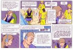
A clone font is what I want

Cieper

New Member
Hey people,
I'm restoring a comic from the 1980's for a republication. I scanned in all the pages and now I'm cleaning and correcting. The texts in the balloons were done by hand back then, and now that I'm fixing mistakes I can't find any font that resembles it enough to make the corrections unconspicuous. It always shows like crazy, and also the balloons don't fit. So I'm not so much searching for a font (that would be useless) as how to make a new font, exactly like the original handwriting... I know that there is software that allowes you to make a font after your own handwriting. But can it also make one after some writing that is on scanned jpg images? Anybody have experience with creating fonts and stuff?
Thanks in advance!
 
I'm sure there is software out there that can do this for you but I can't imagine that it would be able to recreate all the imperfections and blurriness etc of such small, hand-drawn lettering. I would have thought that
it will still look like a new font and not match exactly. I'm wondering why searching for a complete new font is out of the question, there are lots out there, and I don't understand about the balloons not fitting.

I don't know how many letters and words are involved here, but have you tried simply copying and pasting the revisions? Time-consuming I know.
 
I didn't specify how much text corrections I have to make: there are a LOT.
:cries:
I practically have to rewrite half the story. My drawing program (ClipStudioPaint) has a menu for balloon text, but even then copying and pasting hundreds of balloons would take for ever. And even then the fonts would not fit.
So the only way I think I can do that without it taking me the rest of my remaining life time is if I had a font, with which I could just type everything.
If I manage to make a font out of the original letters (they're not that scribbly) with one of those programs like Calligraphr, THAT would be ideal. I don't know if it is possible from letters out of scanned-in text on jpgs, but I'm going have to try finding out.

What I mean about the balloon shapes: they are extremely rectangular, almost square. I tried to fit all sorts of comic fonts in, but the sentences never fit. Either they're too wide and I have to put more words on the next line, which makes the text as a whole larger, and then the balloon is too small, or I have to split words so that the reading becomes difficult. This letter-person who wrote my texts had a really square handwriting. I can't find any font that looks enough like it, they're all too 'round' so to speak. None of them turn out just so as it must. I have to make a new one.

I don't see any way, other than just leave all the mistakes in, and say "print it and be damned".
But I'm too much of a perfectionist for that
:groucho:
 
Well it sounds like you have an almost impossible job, which is why I thought finding a new font would be the only way to do it, I know there are quite a few available in Photoshop.

Can you attach a sample of what you are up against? I did a couple of these back in the day (not for actual comics), it may just be that my handwriting is similar. Still very time-consuming though.
 
There's a plugin/script for InDesign that allows you to define outlined text as a font.
Then you can type each of the characters.

Problem is you have to draw all the characters first.

 
Yes, that's very neat, I wouldn't be able to replicate that. You might be able to find a specialist to do it. The best I could do is copy it the best I can and produce a workable alphabet at a decent size
for you to then turn into a font with something like mentioned above.
 
Yes, DigitalStrip and Anime Ace I already have. Both are very beautiful, but they're too smooth. The writing in this comic is so narrow, it looks like it is economical but in reality it takes a lot of space. I'll check the two others out as well.
If I manage to make a font from the balloons, I'll let you guys know (If you would be interested)
Thanks for the advice
 
Totally get the struggle, matching old hand lettering is tough. You might want to try something like Calligraphr or FontForge. With a bit of cleanup in Photoshop or GIMP, you can build a custom font from the scanned letters. It takes some time, but it’s doable and keeps the look consistent.
 
So far, I'm collecting the alphabet on separate jpgs... I had to do some searching for a Q, an X and a Y :LOL:.
I have an additional problem with the colour: the text looks black at first sight, but if you zoom in it turns out some sort of purple. I am fidgeting with tone correction and levels, but up to now I haven't found a good way to turn the black into real black.
If I make the image monochrome, the letters become "emaciated", you know what I mean? So that doesn't work. I'll have to find an other trick to make that purple black. You'd think it's a simple problem, but it isn't. :confused:
By the way, I use Clip Studio Paint, which is very good.
 
Back
Top