You are using an out of date browser. It may not display this or other websites correctly.
You should upgrade or use an alternative browser.
You should upgrade or use an alternative browser.
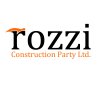
2 logo concepts for Rozzi
- Thread starter NUGFX
- Start date
spottypenguin
Active Member
Could you not make the top of the r into a hammer head shape?
I like the concept, you just need to incorporate the hammer better I think.
ARRIVALS
Well-Known Member
Like Sam said, I think it'd look a lot better if you actually worked on the hammer a little and used it in place of the 'R' instead of sat behind or on top of the letter. Also, I think of a hammer more than a pencil with regards to construction, so prefer the 2nd option.
spottypenguin
Active Member
Like Sam said, I think it'd look a lot better if you actually worked on the hammer a little and used it in place of the 'R' instead of sat behind or on top of the letter. Also, I think of a hammer more than a pencil with regards to construction, so prefer the 2nd option.
Have to agree with my learned colleague - should have said before the pencil doesn't work for me, I don't read it as an "i" at all, almost looks like an excalmation mark / an extra graphical element tagged on the end
Tony Hardy
Well-Known Member
Agree with everyone else here. The hammer definitely reflects construction more than a pencil and incorporating the hammerhead onto the R will work a lot better than it does at the minute.
I'd maybe look at the size/colour and contrast of the tagline. Doesn't sit quite right for me.
I'd maybe look at the size/colour and contrast of the tagline. Doesn't sit quite right for me.
Kev Clarke
Member
Like the concept and would go with what has been mentioned previously with regards to the incorporating the hammer head, you might lose the narrow space dividing the two different sections when logo is small.
Try the tagline in uppercase too, will make it easier to read and look better i feel.
Try the tagline in uppercase too, will make it easier to read and look better i feel.

