Hey guys, been lurking for a while and thought Id finally post.
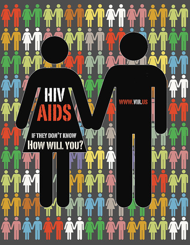
Anyway, here is a poster I did during the week as something to do. The brief (which I adapted from a video/animation brief) was to attract the attention of 13-19 yr olds and ask them to think about HIV and AIDS.
What I tried to do is to go for a bedroom wall kind of poster feel, with different colours to draw initial attention. The font wasn't in the end what I should have gone for although I do feel that it is a strong and contemporary font that demands attention.
I initially put alot more information on the poster but in the end I have tried to provoke thought with an interpretable question which (hopefully) touches a nerve for some teens to find out more information at the mentioned website.
Apart from that, I got this poster properly printed in A2 at my local printers so that I can determine the colour difference between my screen and that of the printers. The background in print was a dark green, and the black couple weren't black black but hey, not sure if this is my computer inaccuracy or the printers.
Any criticism is very welcomed

Last edited: