1970s inspired flyer

idea1smaller.jpg

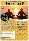
I am in the process of making a charity flyer which is meant to be inspired by vintage 70s. It's very much a work-in-progress and I know that I have a long way to go in making it look great.

I'm not 100% sure about the font for one thing, and I need to work on the "Exchange 1-3 charity items..." bit to make that better (it's just a rough placement). The main image is a stock photo that I will pay to download if the client is happy with it, and will align the sun-rays with the sun itself on the final edit (the yoga people are 'multiplied' onto the sunrays image).

But can anyone give me any other advice on what I can do to improve it please?
 
I'd replace the wood with grass or something, it looks like an advert for plywood.

Starting from the top

"YOGA AT THE Y" - I almost read this as "YOGA AT THEY" and was confused momentarily. I think you need a bigger gap between your words.

The figure on the left of the stock images looks disproportionate, like it's squished vertically, maybe it's just the image.


There's no hierarchy in the 2nd half of the flyer. There's different font sizes for the date and time, and then the location is smaller size.

Ideally, I would put the "date, time, location and price in a column on the right, narrow enough.

Then all the other information in a wider column on the left.

Even up the font sizes.


Remove your details from the flyer, and ask the Yoga people if you can leave some business cards instead.


You could throw down some Facebook icons. And you should make the preregistration dates stand out a lot more. Perhaps boxing off the preregistration information would separate it from the main body text and drive the eye to the important part -after all you want people to register - that's the action of the flyer, get them to register and attend the event and spread the word!
 
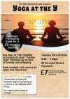
Thank you so much for your analysis Hank, I completely changed the background and font to give it more of a 70s vibe (I only just got your reply Dave, thank you)

idea2smaller.jpg

I'm in two minds whether to put a stroke on some or/and all of my text or not, but I'm pretty happy with the fonts I've used at the moment. And have boxed the pre-register bit now to make that stand out more.

The blank space on the bottom right is meant to be for the company logo, and also to leave space for a food sponsor. The client asked me to put my details on the flyer but I will go with your advice and ask to have business cards instead as I think that makes a lot more sense.

Any opinions are welcome, I really really appreciate the feedback and am very grateful for it.
 
idea2amendedsmaller.jpg

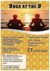
I made another amendment, adding a vinyl record with a promotion. And also playing around with the text alignment.

The yoga people can be moved a bit to the right when I download the final image (I won't pay to download it yet until the client decides on wanting to use it).
 
Trying to read the text on that background is irritating my eyes dreadfully. It feels like i'm looking into one of those magic eye books.

I'm not sure how you have applied the stroke to your text? But it looks as though the stoke is eating into the font. I assume you literally just selected text, hit the 'stroke' icon and select a stoke colour?

I don't really like it if i'm honest. I don't think any of what you have goes well together. Whether it be your stock image, the background, the font. I dunno, it's all a bit amateurish.

I'd like to see some more design options/ideas.
 
Thank you CLHB, I really appreciate the feedback.

I have to admit, the background does look busy, just trying to find a suitable one that is vintage 70's-inspired.

I've just done another edit without the background and the stroke.

idea2strippedsmaller.jpg
 
Last edited:
Didn't see one grass theme - as per my original critique.

I tried with grass textures with the background but wasn't so sure hence why I looked at the 70s wallpaper. Will try out the grass again tonight after work, but for now what do you think of the font and text alignment from the last image I uploaded? I've not really included a background in that one yesterday as I'm still experimenting.
 
Looking back at the original, Hank, I think so too. Will change the title font and experiment with grass backgrounds as well. I also made the vinyl record a bit smaller as well to make that look cleaner.
 
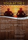
Hey Hank. Thank you so much for the feedback. I just made a huge re-edit of the text, background and image.

I've used grass but not feeling a 70s vibe at the moment, though I'm happy with the new image and these fonts.

2014-10-03_1743.png


I'm currently looking for different grass textures, but also doing a couple more flyer styles from the link you gave me earlier.
 
That definitely looks better, the new stock image alone makes it look more fitting. I would change the colour of the grass to match the grass colour in the stock image, so that it doesn't look as disconnected. It is much better without the vinyl too as that made no sense to me. You could be a bit more imaginative with how you present the text though.

Research - the first and most important stage of any design!

PS. The first grass texture is much nicer than your second one.
 
That green filter over the background is horrible. When I said to match the colour of the grass in the image, I didn't mean put a green filter over the whole thing. I meant change the colour of just the grass alone so that it matches the grass colour in your image. What you have done has changed the colour of the dirt between the grass to green as well as the grass itself. It does not look authentic, as everything is now all just one shade. What you need to do is make a selection of the grass alone, the brown colour in-between the grass can stay as it is. As it stands with the green filter over the image, you can't tell that it is grass, it just looks like a green fury background.
 
The text is still not working for me. Looks like you have just plonked some text over a background image with no real thought. Also, it is too close to the edge of the page (just decrease the font size a tad to make room). You have got a bar with some nice colour variations under the 'YMCA 'that you could incorporate into the design to make the text information more interesting to look at. I'd also make the drop shadow on your 'Pre-register now' box a bit more subtle, I would even consider maybe flipping the shadow the other way, I don't like the way it is moving my eyes towards the left of the page when I have more information to read in the right hand column.
 
Remove your details from the flyer, and ask the Yoga people if you can leave some business cards instead.

Completely disagree with you there.

What do you gain from removing it? Absolutely nothing.

Providing your credit actually fits with the design, you're shooting yourself in the foot by removing it. These days, flyers are used for digital distribution, not just physical - you're increasing your potential audience by leaving it on. Heck, people may see it and check you out - but those people might not go to the event and ask (or remember for that matter) to pick up a business card.

Leave your credit on there, just make sure it works in the design.
 
Back
Top