biju
Member
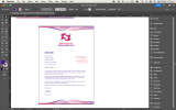
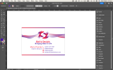
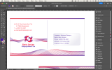
First, you can use a different color schema. The current color scheme is a bit busy. You could try using a simpler color scheme, such as black and white or two complementary colors. You could add a plain and simple font. Popular choices include Helvetica, Arial, Futura, and Proxima Nova. Check an example!Hey Biju, thanks for your help! I made a different business card. What do you think?
<moderator note>
Please do not recreate artwork - we do not allow this. The artwork needs to be done by the OP.
Last edited by a moderator: