You are using an out of date browser. It may not display this or other websites correctly.
You should upgrade or use an alternative browser.
You should upgrade or use an alternative browser.
Logo and business card design
- Thread starter Maria
- Start date


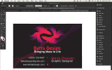


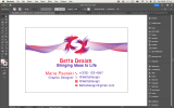
Why are your cards in RGB?
Should be CMYK mode and using spot colours with CMYK equivalents.
It's not called Twitter it's called X and a different logo.
Icons are enough, you don't need to spell them out
Can someone follow you on your phone number? Maybe it should be Contact:
I get the fish angle- but it looks like an aquarium designer or something on first glance.
Lose the fish eyes - and just use the shapes - so it's less obvious they are fish, but still fish but not obvious.
Those thin lines swirling in the background - gonna be tough to hold/replicate them in print.
Bringing ideas to life doesn't look centred - and if it's supposed to be left aligned it looks off.
Some cards have websites and email addresses
If you have a Website - then you have access to an email address - instead of using GMAIL
You can still use Gmail to access your mail - or use outlook - it doesn't really matter.
But your email address looks more profession if it's [email protected]
----------------
Keep it simple - keep it clear
----------------
============
@biju
Don't copy other peoples work and pass it off as your own
Reverse image search is very easy and not a good look to be plagerising other designs.
Hey, my teacher instructed me to use only two Pantone colors in RGB, and I'm under the impression that white and black are not typically considered as colors. (I'm still not sure)Why are your cards in RGB?
Should be CMYK mode and using spot colours with CMYK equivalents.
It's not called Twitter it's called X and a different logo.
Icons are enough, you don't need to spell them out
Can someone follow you on your phone number? Maybe it should be Contact:
I get the fish angle- but it looks like an aquarium designer or something on first glance.
Lose the fish eyes - and just use the shapes - so it's less obvious they are fish, but still fish but not obvious.
Those thin lines swirling in the background - gonna be tough to hold/replicate them in print.
Bringing ideas to life doesn't look centred - and if it's supposed to be left aligned it looks off.
Some cards have websites and email addresses
If you have a Website - then you have access to an email address - instead of using GMAIL
You can still use Gmail to access your mail - or use outlook - it doesn't really matter.
But your email address looks more profession if it's [email protected]
----------------
Keep it simple - keep it clear
----------------
============
@biju
Don't copy other peoples work and pass it off as your own
Reverse image search is very easy and not a good look to be plagerising other designs.
View attachment 8717
Why are your cards in RGB?
Should be CMYK mode and using spot colours with CMYK equivalents.
It's not called Twitter it's called X and a different logo.
Icons are enough, you don't need to spell them out
Can someone follow you on your phone number? Maybe it should be Contact:
I get the fish angle- but it looks like an aquarium designer or something on first glance.
Lose the fish eyes - and just use the shapes - so it's less obvious they are fish, but still fish but not obvious.
Those thin lines swirling in the background - gonna be tough to hold/replicate them in print.
Bringing ideas to life doesn't look centred - and if it's supposed to be left aligned it looks off.
Some cards have websites and email addresses
If you have a Website - then you have access to an email address - instead of using GMAIL
You can still use Gmail to access your mail - or use outlook - it doesn't really matter.
But your email address looks more profession if it's [email protected]
----------------
Keep it simple - keep it clear
----------------
============
@biju
Don't copy other peoples work and pass it off as your own
Reverse image search is very easy and not a good look to be plagerising other designs.
View attachment 8717
Therefore, I have to change the black background to white. Additionally, I have to create the recto side, but I still have to include some information.
Last edited by a moderator:
Two Pantone colours in RGB - your teacher is completely off or you misunderstood.
Print should be designed in CMYK mode - regardless of Pantone or not.
White is not typically a colour in litho print or digital print, but can be a colour in flexo/screen etc.
Black is a colour - it's a pigment of CMYK (Cyan Magenta Yellow Black)
You haven't got 2 colours - you've got 3
Black
Pink
Blue (the hue) unless that's not intended
What happens to Black in print that's in RGB?
It converts to 4 colour black using CMYK
So your document should be CMYK
the black should be 100% black and 50% of 1 of the pantone colours (to give a Rich Black) (typically you'd use 50% cyan - but you're using Pantone - so you use 50% of the coolest colour)
That would give you a 3 colour print job
Black Pink/Purplely (blue)
All that aside - it won't matter for your business cards really as they will be printed digitally
If your document is RGB and you send to print like that it won't matter - because Digital will convert to CMYK anyway (and some can print Pantone colours)
But there's a lot wrong with your setup.
I think you should consult your tutor again.
I just think my professor wants to see if I can use RGB, I have no intention of printing it anyway. I changed the black to white to be within the subject for sure. Now I have 2 Pantone colors. If I use a red or a blue with less transparency, will it be nicer in the position of the white in the background?Two Pantone colours in RGB - your teacher is completely off or you misunderstood.
Print should be designed in CMYK mode - regardless of Pantone or not.
White is not typically a colour in litho print or digital print, but can be a colour in flexo/screen etc.
Black is a colour - it's a pigment of CMYK (Cyan Magenta Yellow Black)
You haven't got 2 colours - you've got 3
Black
Pink
Blue (the hue) unless that's not intended
What happens to Black in print that's in RGB?
It converts to 4 colour black using CMYK
So your document should be CMYK
the black should be 100% black and 50% of 1 of the pantone colours (to give a Rich Black) (typically you'd use 50% cyan - but you're using Pantone - so you use 50% of the coolest colour)
That would give you a 3 colour print job
Black Pink/Purplely (blue)
All that aside - it won't matter for your business cards really as they will be printed digitally
If your document is RGB and you send to print like that it won't matter - because Digital will convert to CMYK anyway (and some can print Pantone colours)
But there's a lot wrong with your setup.
I think you should consult your tutor again.
Attachments
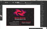
I like the fish are a little less distinguishable - it's certainly more appealing to me anyway.
I still think good design practice - regardless if printing or not - should be practiced - that is not having too many thin lines - think on a business card it will be small and you don't want it to get messy.
Again less is better
Does it have to say 'Contact with us on' - is that necessary? People know it's phone, X , instagram
You've no email address or website on the card.
Your card is your big hello to a client
You want all your info on there but minimal enough it's not crowded.
---
And for experiment - in Illustrator go to Window>Separations
You don't see any colours as it's supposed to show the Pantone colours but it doesn't as Separations are for print
if you go to Window>Documnet Mode>CMYK - they will show there - this is how you check your separations for print.
But that's another story.
I have to make a business card but only the recto side. I have to add some information but not everything.I like the fish are a little less distinguishable - it's certainly more appealing to me anyway.
I still think good design practice - regardless if printing or not - should be practiced - that is not having too many thin lines - think on a business card it will be small and you don't want it to get messy.
Again less is better
Does it have to say 'Contact with us on' - is that necessary? People know it's phone, X , instagram
You've no email address or website on the card.
Your card is your big hello to a client
You want all your info on there but minimal enough it's not crowded.
---
And for experiment - in Illustrator go to Window>Separations
You don't see any colours as it's supposed to show the Pantone colours but it doesn't as Separations are for print
if you go to Window>Documnet Mode>CMYK - they will show there - this is how you check your separations for print.
But that's another story.
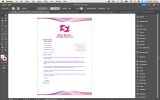
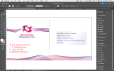
I want to have something to add to the back.
Part of the discussions as a designer with a client will be determinimg what goes on the cards and what information will be most relevant.
You'll get it a lot in event posters with clients giving you a venue and not a date.
And here you have business card and the best way to contact the person. Is the web trafficost important. Contact by email most important.
Hierarchy and structure of information will be everyday decisions
You'll get it a lot in event posters with clients giving you a venue and not a date.
And here you have business card and the best way to contact the person. Is the web trafficost important. Contact by email most important.
Hierarchy and structure of information will be everyday decisions
Part of the discussions as a designer with a client will be determinimg what goes on the cards and what information will be most relevant.
You'll get it a lot in event posters with clients giving you a venue and not a date.
And here you have business card and the best way to contact the person. Is the web trafficost important. Contact by email most important.
Hierarchy and structure of information will be everyday decisions
Attachments
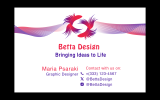
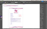
I wouldn't apply for a job using my own company name and stationery... you're applying to work there, are you not? They'd be concerned that you have a side business and wouldn't be focussed on them.
If you're applying to be their graphic designer as an outsourced or a freelance business - then it's fine and appropriate.
I don't really get why you have gmail again - if you have a website you'll have an email address for that- mentioned this earlier.
I have no idea what the last one is.
If you're applying to be their graphic designer as an outsourced or a freelance business - then it's fine and appropriate.
I don't really get why you have gmail again - if you have a website you'll have an email address for that- mentioned this earlier.
I have no idea what the last one is.
You.re right, I get a little bit confused. The other one supposed to be an envelopeI wouldn't apply for a job using my own company name and stationery... you're applying to work there, are you not? They'd be concerned that you have a side business and wouldn't be focussed on them.
If you're applying to be their graphic designer as an outsourced or a freelance business - then it's fine and appropriate.
I don't really get why you have gmail again - if you have a website you'll have an email address for that- mentioned this earlier.
I have no idea what the last one is.

You.re right, I get a little bit confused. The other one supposed to be an envelope
Attachments
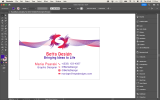
I think the details you've improved on - the little things - it is looking better and better with the tweaks you have made.
Keep going.
But I wouldn't be a fan of the swish - difficulties printing would be a key concern.
But should be ok for a fun non-printed project.
Keep going.
But I wouldn't be a fan of the swish - difficulties printing would be a key concern.
But should be ok for a fun non-printed project.
Thanks for helping out! I'm not NCR printing anything, it's just for the assignment. Can you check if everything is in the right place on each artboard?I think the details you've improved on - the little things - it is looking better and better with the tweaks you have made.
Keep going.
But I wouldn't be a fan of the swish - difficulties printing would be a key concern.
But should be ok for a fun non-printed project.
Last edited by a moderator:
I know you're not printing anything.
I'll put it like this - I wouldn't practice a piano song on a drumset.
Anyway - I haven't seen your brief so I have no idea if you hit your mark or not.
But I hope some pointers were helpful.
I'll put it like this - I wouldn't practice a piano song on a drumset.
Anyway - I haven't seen your brief so I have no idea if you hit your mark or not.
But I hope some pointers were helpful.
biju
Member
Why are your cards in RGB?
Should be CMYK mode and using spot colours with CMYK equivalents.
It's not called Twitter it's called X and a different logo.
Icons are enough, you don't need to spell them out
Can someone follow you on your phone number? Maybe it should be Contact:
I get the fish angle- but it looks like an aquarium designer or something on first glance.
Lose the fish eyes - and just use the shapes - so it's less obvious they are fish, but still fish but not obvious.
Those thin lines swirling in the background - gonna be tough to hold/replicate them in print.
Bringing ideas to life doesn't look centred - and if it's supposed to be left aligned it looks off.
Some cards have websites and email addresses
If you have a Website - then you have access to an email address - instead of using GMAIL
You can still use Gmail to access your mail - or use outlook - it doesn't really matter.
But your email address looks more profession if it's [email protected]
----------------
Keep it simple - keep it clear
----------------
============
@biju
Don't copy other peoples work and pass it off as your own
Reverse image search is very easy and not a good look to be plagerising other designs.
View attachment 8717
Please accept my sincere gratitude; I did not claim it as my own. I created an Idea. This is simple and wonderful. I've made a payment for this design. However, I'm aware of your cautionary advice.