Canny Creative Rebrand

Tony Hardy

Well-Known Member
Hi everyone,

Admin; I think the post "Type Lockup Issues" can be deleted now as I've decided to create a new post to post everything into.

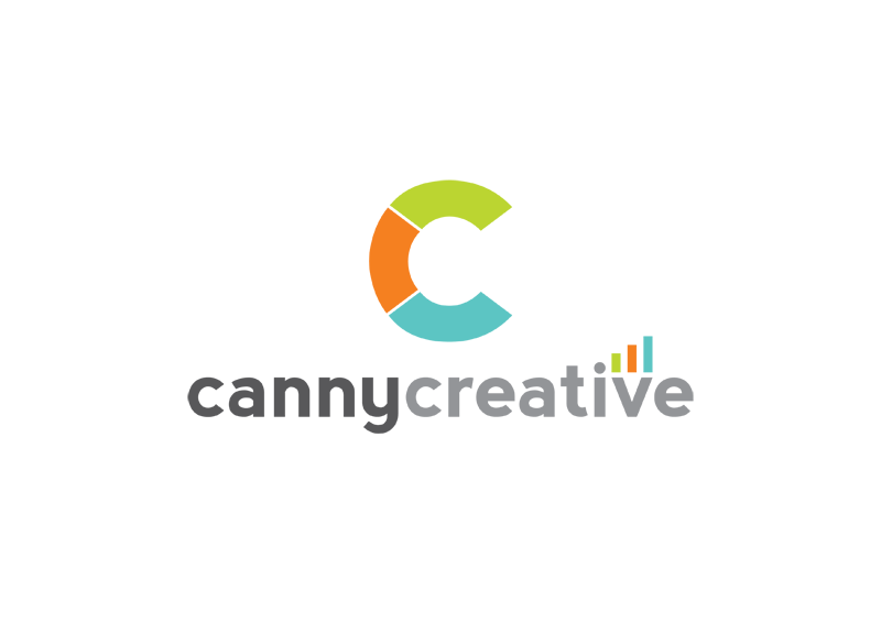
I'm in the process of rebranding Canny Creative and wondered how anyone thought this looks? I'm trying to get across two ideas "communication" and "increase profit via design".

cannycreative3-01-1.png


I'm really struggling with the business card;

businesscard.png


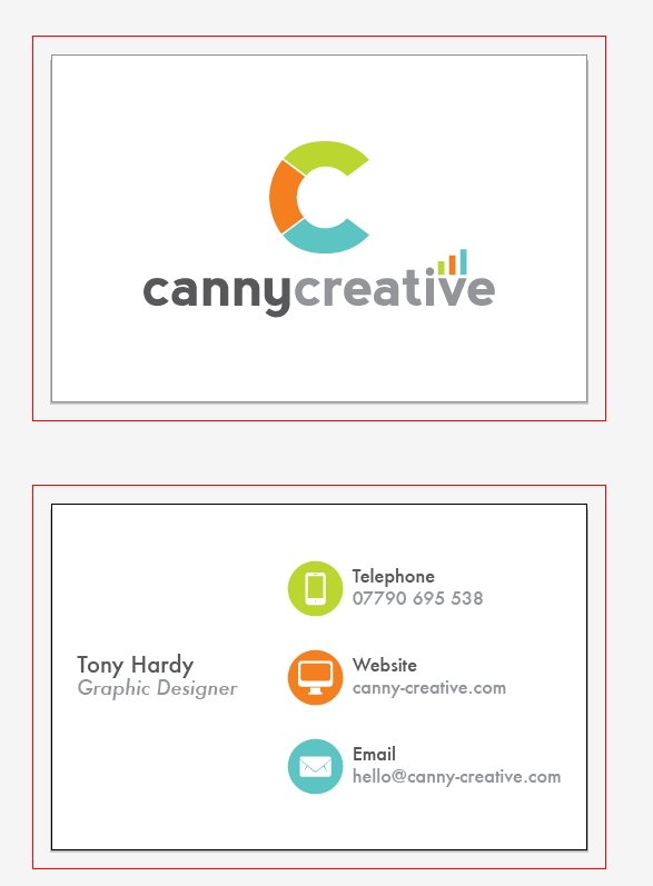
Don't know if the font choices are cohesive enough.

Any C&C appreciated.

Cheers,
Tony
 
Personally I would probably lose the "pencil", I think it comes across more as statistics / scientific than creative.

I quite like your C - how about working on something along those lines as 2 interlocking / overlapping Cs and the name below?
 
In fact ... you could maybe make something with 2 Cs that could perhaps hint at an infinity sign; "enduring designs" kinda thing? - just an after thought :)
 
Problem with interlocking C's and working with that shape is that it either looks like;

a) an ear
or b) Coco Chanel

In regards to the "pencil" I've altered it to look more "bar graph" and "phone signal strength". Both in relation to statistics (marketing) and communication.
 
@andybdesign

Totally agree with you on the C shape. I did use the C from the font, it looked like the natural thing to do. But, after sleeping on it and coming back to it, I can see exactly what you mean. Anyway, I've left the business card just for the moment, but now, I'm debating whether I like the C closed or open, as below;

logo-adaptedC-01.png


logo-adpatedCclosed-01.png
 
I think I like it with the separations but now I keep seeing it as a lifesaver thingy...honestly not a criticism, my brain works in peculiar ways :icon_biggrin:
 
i like it, defo use the one with the breaks in the C but when u make the logo smaller the breaks would be hard to notice, id make the break a bit wider, as 4 ur Bus card. im not a fan of the italic "graphic designer" the G and D look thicker to the rest of text. the info gfx are nice, the colours are nice choice also. maybe a water mark of the C on bk of bus card or have it inverse black.
 
I think I'm going to start the business card design again. Just can't seem to get the font choice right at all.
 
yeah font choice has to be perfect, have u tried 2 create your own font to make it custom?

The font for the "Canny Creative" typeface is fairly customised.
I didn't think about creating my own for more "body copy" type elements.
 
I quite like it as a whole.

I don't get the 'graph' thing at all - it's too fussy and doesn't add anything, other than making you look like a mobile phone company. I'd lose is completely and just go with the 'canny creative' and the big C. And use the typeface you based the logo on (Akzidenz? Interstate?) for the body copy rather than Futura, then everything will sit together better.
 
And use the typeface you based the logo on (Akzidenz? Interstate?) for the body copy rather than Futura, then everything will sit together better.

The font the logo was based on is called Nevis.

I've ordered my cards from Stationery Direct, the design ended up quite different to this. The logo stayed the same, bit of an edit on the C, but kept the bar graph, sorry ;)
 
Back
Top