Advice on logo creation.

inferno-prime

New Member
Hello

I am building a website for gaming. I am not a graphic designer but do have an interest in the field.

I went to another forum for advice on my first design but I guess I was kinda offended by their one of the responses. Anyway getting off topic I want to know how to tell if its good enough to use and not something that would be laughed at.

Any tips ?
 
Criticism and cynical responses need to be taken on board - put on a thick cardigan, as you need to protect yourself.

Don't ever think that these negative criticisms are off the cuff remarks and designed to cut you down. These remarks are to help you improve.

What use would it be if everyone just said "It looks great! Well done - no changes required - run with it!!!"?
 
Hello

I am building a website for gaming. I am not a graphic designer but do have an interest in the field.

I went to another forum for advice on my first design but I guess I was kinda offended by their one of the responses. Anyway getting off topic I want to know how to tell if its good enough to use and not something that would be laughed at.

Any tips ?
We can't really help you if we don't have any material on which we could give some feedback.
 
Hello

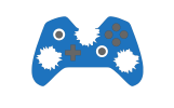
Sorry it has taken me so long to get back here but I have had other issues come up. So far these lame attempts are all I can think up for my logo (GamerZ Extreme) which is about PC gaming news/mods etc.. I was told my original idea of having a gamepad with bulletholes was not simplified enough so I tried some other ideas. I know these probably look pretty basic.

I also need to make a youtube banner any ideas other then just text and a logo ? like a good background idea.
 

Attachments

  • test.png
    test.png
    64 KB · Views: 9
  • test1.png
    test1.png
    389.1 KB · Views: 9
  • test2.png
    test2.png
    95 KB · Views: 10
I have an interest in quantum mechanics. This does not mean, I am suddenly going to become the next Niels Bohr.

i think you need a graphic designer. Sorry if that sounds harsh, but I am afraid, this is so far off the mark of being credible, that I think you need someone who knows what they are doing to help out.

Aside from anything else, using images based on proprietary hardware, you risk legal action from said copyright holders.
 
The designs are a bit meh in all honesty.

I can see a Z shape in a game controller... just saying...
 
Thank you for your reply Levi.

Unfortunetly I can't afford a Graphics Designer so I want to learn to atleast make a logo for myself. The only part I can't understand is how do I know when its good enough to really use.
 
When the client is happy and/or they pay you.
Even then, we’ve all seen shameful work that will never do its intended job, which clients have been ‘sold’ (and presumably paid actual money for) by unscrupulous ‘designers’ who have never learned their craft and have no idea what they are doing.

If you really want to learn, in order to make a career and take money from clients for a product, I’d always recommend getting an education. At very least, get an entry level job in the industry and learn that way.

If you want to do it for fun and for yourself, then learn from the best and read everything you can. Don’t just rely on the internet. Read what people like Wally Olins, Alan Fletcher, Massimo Vignelli (to name a few) have to say.

Learn what a logo is, in relation to a brand. A logo is not about a pretty adornment to fill a hole at the top of a website or letterhead. It has a job to do as part of a coherent whole.

Please, please don’t just look at a few Pinterest pages and think you know what you want, then simply add to the increasing cacophony of visual noise out there. Add something to the pot, don’t just water it down. It is definitely not one of those subjects you can learn on a rainy Sunday afternoon and, bingo, you’re a designer. Most of us have either done a degree, or learned on the job, mentored by people who have been doing it for 20+ years, then gone out there and gained our own stripes with at least 5 years’ experience before even thinking about selling our wares to clients as a freelance designer.

What is your goal? Is it something you want to pursue as a career?

 
Unfortunetly I can't afford a Graphics Designer so I want to learn to atleast make a logo for myself. The only part I can't understand is how do I know when its good enough to really use.
Doesn't matter. Nobody cares. It's a gamer website, focus on the content not the logo. If the website becomes popular you can then sort out some branding.
 
You don't need a logo, just make do with a namestyle. It's patently obvious to us that you do not have the ability to design one yourself and you can't afford a designer. Concentrate on what you do best.

Just use the name in a nice, modern, simple font and go with that until you can afford to 'develop your brand'. Just take a look at some random websites -
many of them don't have an icon or a mark these days. You're not building a clothing brand or something like that, that needs a recognisable logo.

If you insist you need a logo, remember K.I.S.S. Just a simple GE would suffice.
 
What is your goal? Is it something you want to pursue as a career?
Might have helped if I had read your original post properly. You are not looking to become a designer, so my tedious monologue is all but redundant. My defence. A bout of 4am insomnia. In the light of this, I’d go with Wardy’s advice.
 
So you can do this rather simply.

Think of a six shot revolver.

It's basically a cog shape.

With some holes around it for the bullets

Here's a basic example

1593077836571.png


You could then put the game control pad symbols in the cirlces - etc.

This would give you the controller theme - along with the bullet theme.
A weird theme - but it's yours!
 
Even then, we’ve all seen shameful work that will never do its intended job, which clients have been ‘sold’ (and presumably paid actual money for) by unscrupulous ‘designers’ who have never learned their craft and have no idea what they are doing.
I never said when 'we' are happy because sometimes there is that point where you just have to let the client have what they want or you end up wasting more time etc.
 
Might have helped if I had read your original post properly. You are not looking to become a designer, so my tedious monologue is all but redundant. My defence. A bout of 4am insomnia. In the light of this, I’d go with Wardy’s advice.
It's alright I completely understand my mother has Insomnia.

Doesn't matter. Nobody cares. It's a gamer website, focus on the content not the logo. If the website becomes popular you can then sort out some branding.
Thank you very much!

You don't need a logo, just make do with a namestyle. It's patently obvious to us that you do not have the ability to design one yourself and you can't afford a designer. Concentrate on what you do best.

Just use the name in a nice, modern, simple font and go with that until you can afford to 'develop your brand'. Just take a look at some random websites -
many of them don't have an icon or a mark these days. You're not building a clothing brand or something like that, that needs a recognisable logo.

If you insist you need a logo, remember K.I.S.S. Just a simple GE would suffice.
This did cross my mind when I was reading about the logo types.

So you can do this rather simply.

Think of a six shot revolver.

It's basically a cog shape.

With some holes around it for the bullets

Here's a basic example

View attachment 7521


You could then put the game control pad symbols in the cirlces - etc.

This would give you the controller theme - along with the bullet theme.
A weird theme - but it's yours!
I will try this thanks.

Thank you everyone for your advice and I will try harder to understand and hope I can count on your advice again in the future for any designs I can come up with.:)
 
Hello again.

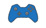
This is an update:I have dropped the bullet hole idea and just went with simplicity this time. I have chatted with a graphics designer on discord and we have settled on this design for right now. I will update it in time with something better if need be.
 

Attachments

  • favicon.png
    favicon.png
    11.7 KB · Views: 3
Honestly, that sucks, it's basically the same design as the very first one up top, just changed the colours slightly.... all it says to me is game controller (xbox) it doesn't relate to your brand in any way whatsoever.

I hope you didn't pay the graphic designer you chatted to on discord because they did you a disservice (hopefully not one of our regulars), we could have guided you far better if you'd have used us on here instead and I would have put money on you/us coming up with a better design.... hell I even gave you a suggestion about the Z shape....
 
Back
Top