Here’s what I posted over on the US forum:
––––––––––––
Straight away, if modern – for whatever that’s worth – is a requirement, surely appropriate/effective would be a better direction to go in. Of course no-one wants what they do to look like a pastiche of a bygone time (unless intentionally so), but positively seeking ‘trendy / modern’ look will likely send you the wrong way.
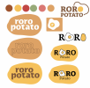
With this, the first thing that strikes me is that, it is called roro potato and the thing I am getting from this, predominantly, is ‘fried egg’. I am also not a huge fan of the name. It is a bit of an awkward mouthful – not a good look for someone selling food!
Colours. To me they actually do look quite dated, especially the main sludge/caramel colour.
Type. Some of the letter shapes really jar, especially that crossbar on the lower case ‘t’, the top curve of the bowl of the ‘p’, bowl on the ‘a’, and the shoulder of the ‘r’. Is this a freebie font? It hurts.
Overall it is a bit of a visual cliché and doesn’t tell me anything about the flavour of the restaurant. Potato is not really something I would associate with breakfast anyway, apart from waffles, perhaps. That may be because it is outside of my frame of reference, being a Brit. I’d never have potatoes for breakfast. Eggs yes, but potatoes?! Is that a US thing?
Overall, it isn’t saying breakfast (hearty, healthy, or otherwise) to me, either actually, or emotionally, let alone giving me any sort of idea of the kind of breakfast I’d be getting – apart from a bit brown.
What kind of place is it? Diner-style. lazy Sunday morning, healthy, fast, exciting, fun. See what I mean? I can’t discern from this, colour-, image-, or type-wise what I am going to get. Well, apart from the colour. From this, I do get an idea and it is not all that appealing, I’m afraid.
Again, you have to temper some of my comments, with potential differences in cultural expectations. That is something for someone on your side of the pond to comment on.
Hope this helps.


")