Hey everyone, hope someone is able to help me on this. Does anyone have access to a Pantone colour bridge guide at all?
Doubt you need this at all.
I work for a small company and we only have the standard Pantone colour guides coated and uncoated. However, a colour in our branding is getting too many inconsistencies when printing in CMYK.
I have read a recent blog online which said that Adobe software cannot be relied on anymore for converting Pantone colours and the only way to get a definite CMYK colour matched to a Pantone colour is by using the bridge guide.
What a load of nonsense - Adobe is the leading standard in the design for print world.
If you're converting the Pantone colour to CMYK - then you are controlling the conversion - and if it's the same Adobe PDF used each time then the CMYK values are always going to be identical.
What you're coming up with is probably the printing of the pieces by various print providers - even the same print provider, using a different printing machine (yes it could be different from 2 different lithographic printing machines) - and you'd also see colour variations moreso in digital printing.
In short - if you're converting the colours to CMYK then the CMYK values should be the same - and the printers should be able to match your printed colours.
The Bridge guide is only a representation of how the Pantone colour MAY look when printed in CMYK - it's a side-by-side comparison of the Pantone ink alongside the CMYK version - as Pantone and CMYK have different gamuts, and some Pantones/CMYK or out of gamut.
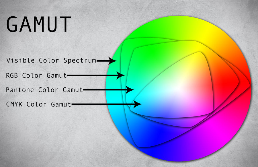
Gamut is just a colour range - and here's a diagram of what is meant by "out of gamut".
As you can see - Pantone has a wider gamut and larger array of colours it can print outside of CMYK - CMYK is the smallest gamut (range of colours) that can be produced. When you convert Pantone to CMYK anything that is "out of gamut" is changed to the CMYK reference in that little triangle of colours we see beneath.
What Bridge offers is the chance to view the Pantone colour alongside the CMYK colour to see what the difference is when converted from Pantone to CMYK.
There are other variables, like humidity, paper type, heat, cold, type of printing press and other factors.
Most printers would have the Bridge book and be able to make this comparison on your behalf.
It's way more expensive than the standard one and so I doubt my company will purchase it. We only need it for these two colours.
You should ask them - that's the best way to find out! But you don't need this.
What it would be good for is to find a CMYK breakdown closer to your Pantone - as it's sometimes not a straight swap to go directly from Pantone to the CMYK version - as you can see by the diagram above, the CMYK version may be out of gamut to the Pantone version - so adjusting your CMYK breakdown to a closer match of the Pantone colour would be the best option.
If anyone on this forum has access to the Bridge guide and doesn't mind supplying me with the CMYK colour values for Pantone 2727C and also Pantone 199C, I would be super grateful as well as a photo of each swatch so that I can see if the Pantone references we have chosen are just too far out of the CMYK colour gamut.
A photo won't be colour accurate.
There's an online site
https://www.pantone.com/color-intelligence/color-education/x-ref
The best thing to do when using Spot Colours in print - is to leave it all as Spot Colours and send it to the printers.
Adobe don't breakdown colours into CMYK - they are colour profiles supplied to Adobe that is used to convert the Pantone to the CMYK based on the printing colour profile required, like Euroscale or Coated Gracol.
Adobe are not converting - but using supplied Colour Look Up Tables (CLU Tables) to convert the Pantone to the CMYK for the profile required.
That's why - it's your best bet to leave the Pantone Colours as is - as your print provider will convert the file to CMYK in their RIP - and RIPs tend to have the most up to date CLU Tables to refer to. Plus the printing company will also be able to know what Pantone colour you are looking to reproduce - and have a reference to compare the Pantone colour the CMYK print - and make the adjustment on the press to get as close as a match as possible.
What you should also be doing is using a single print provider where possible - but if you're using multiple printers using lithographic printing or digital printing - to supply them a sample to match the colours - where possible.
If you must supply CMYK files - then also provide them with the Pantone Colours you are looking to be as close to as possible.
But typically this day and age - supplying a file with the spot colours yields better results than managing a Colour Conversion on your own end without knowing the printing presses that it will be outputting your files.


") ).
).