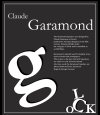
Claude Garamon, Punhcutter, lenghty. There is what seems to be a double space between Serif and typeface. Why does serif have a cap S? There are some very odd line breaks.
I know this seems nit-picky, but you need to learn to be thorough. Attention to detail matters.
As to design and layout, the middle one feels mor appropriate. Better use of white space. Not sure why, on the others, the glyphs are skewed. Doesn’t add anything and, in fact seems at odds with the font. This would me more appropriate for a futurist font than a C16th one.
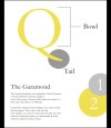
What is the reason for highlighting the two elements of the anatomy of the Q. Given that you have chosen to give a little history of the font and it’s designer, it might have been more fitting to illustrate this with an early use of the font, perhaps?
It is better to have imagery that supports text. If your text was talking about the elegant curves of the font, then using anatomy terms would make more sense. See where I am going? If there is not a reason to use something, then better not to.
What are you trying to communicate and to whom?
Hope this gives you a bit of food for thought.